BP HQ
Eco friendly graphics for the world's biggest energy provider
BP HQ
Eco friendly graphics for the world's biggest energy provider
In a nutshell
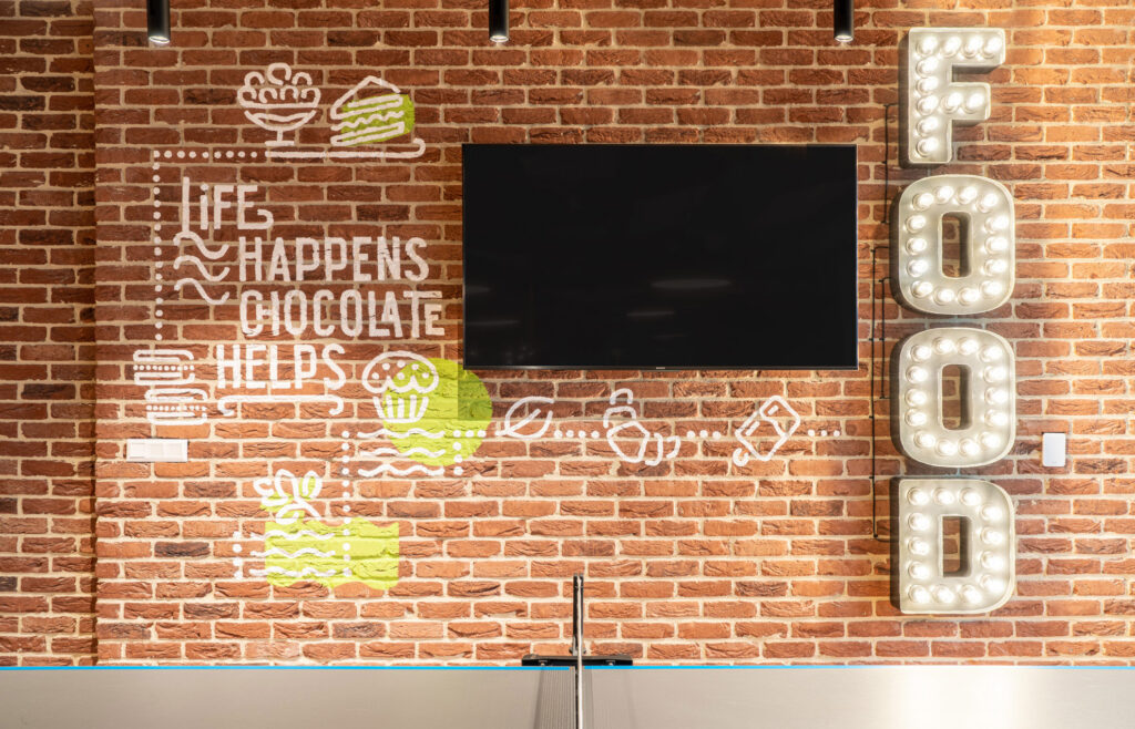
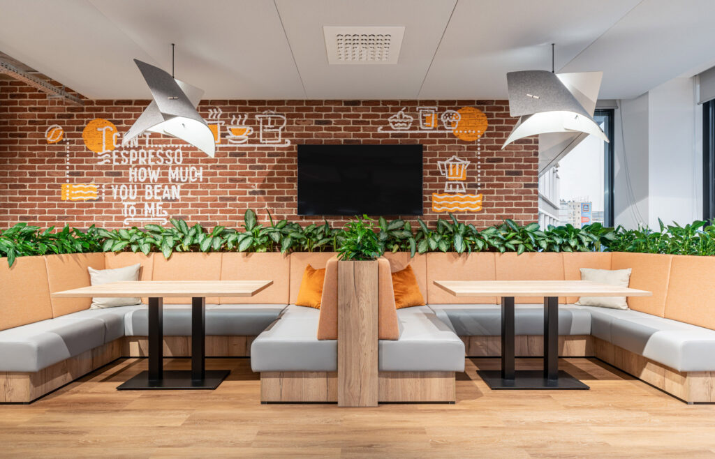
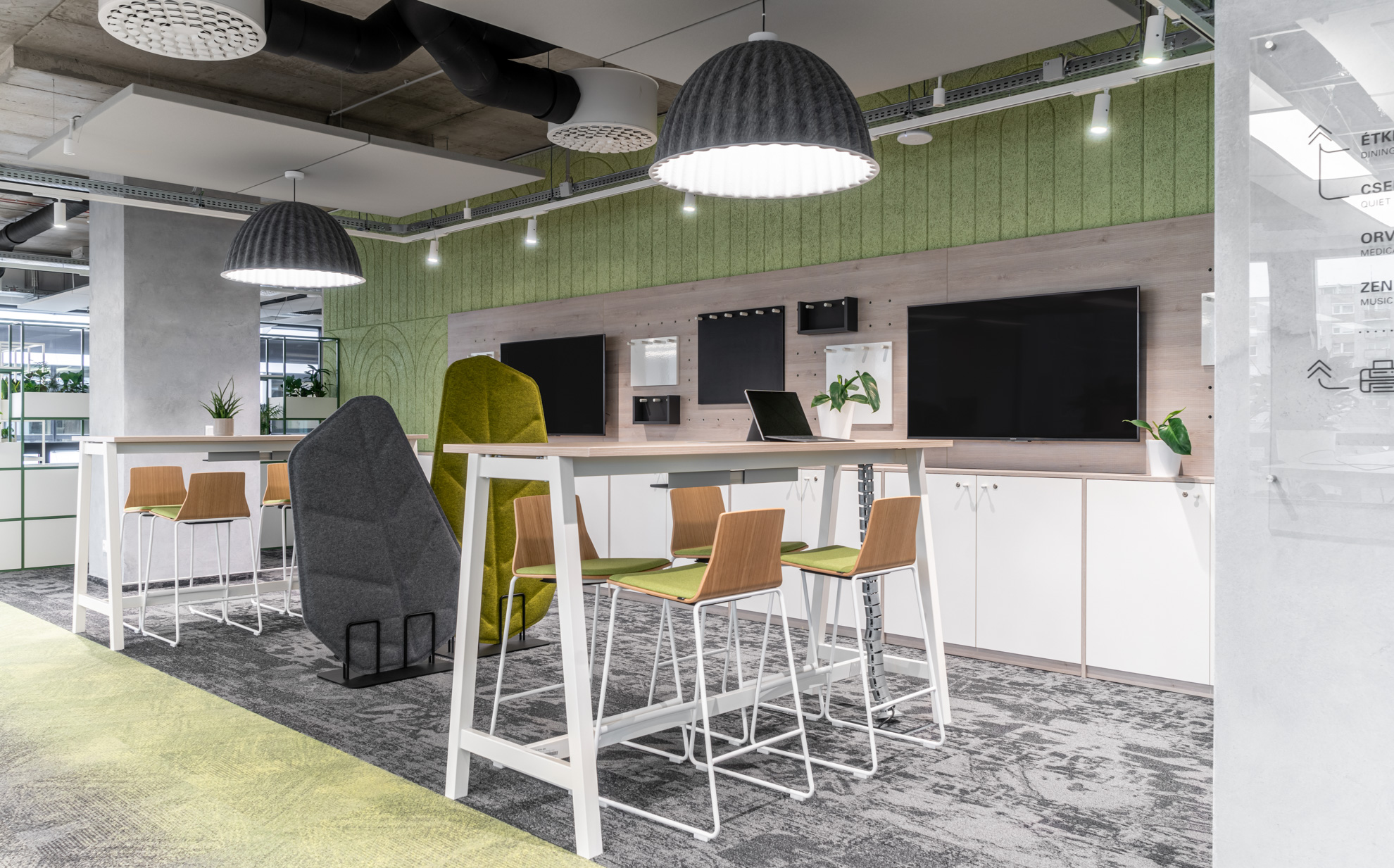
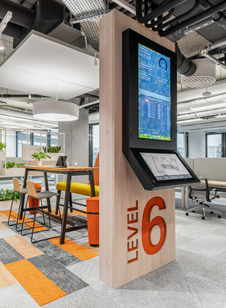
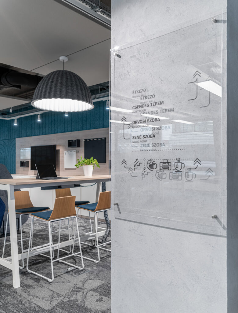
On behalf of DVM Group, we were asked to help with the communication at bp’s Budapest head office using personalised wall graphics and signs. With 22,000 square metres to navigate, good signage is essential, so we carefully designed a clear system. Colour-coding is also useful for wayfinding. However, our favourite feature is the display of life advice in the canteens.
Category:
Client:
DVM Group
Designed:
2019-2020
Built:
2020
Creators:
- Tamás Eke – Art director, graphic design, pm
- Rebekka Ivácson – graphic design, signage, murals
- Painter crew: Anna, Timi, Lóci, Rita, Réka, Huba, Zorka, Bálint, Nándi, Dóri
Photos:
Zsolt Hlinka
Publications:
Recognitions:
BP HQ
On behalf of DVM Group, we were asked to help with the communication at bp’s Budapest head office using personalised wall graphics and signs. With 22,000 square metres to navigate, good signage is essential, so we carefully designed a clear system. Colour-coding is also useful for wayfinding. However, our favourite feature is the display of life advice in the canteens.
Category:
Client:
DVM Group
Designed:
2019-2020
Built:
2020
Photos:
Zsolt Hlinka
Creators:
- Tamás Eke – Art director, graphic design, pm
- Rebekka Ivácson – graphic design, signage, murals
- Painter crew: Anna, Timi, Lóci, Rita, Réka, Huba, Zorka, Bálint, Nándi, Dóri
Publications:
Recognitions:
The company
is one of the world’s largest energy companies. As well as providing people with heat, light and mobility, they are committed to reducing their carbon footprint and protecting the environment. They support their global business from their office in Budapest. It is important to them that their employees work well as a team, that they provide an inclusive and balanced environment and that they encourage personal development for all. We had to integrate our graphics into DVM’s interior design world, which is always a rewarding task. We were given clearly defined graphic moods so we had a common starting point. The bp management did not have a say in the graphic style, but in the content. The design manual was binding in terms of signage, but in other areas we only adapted the character.
Wall decorations
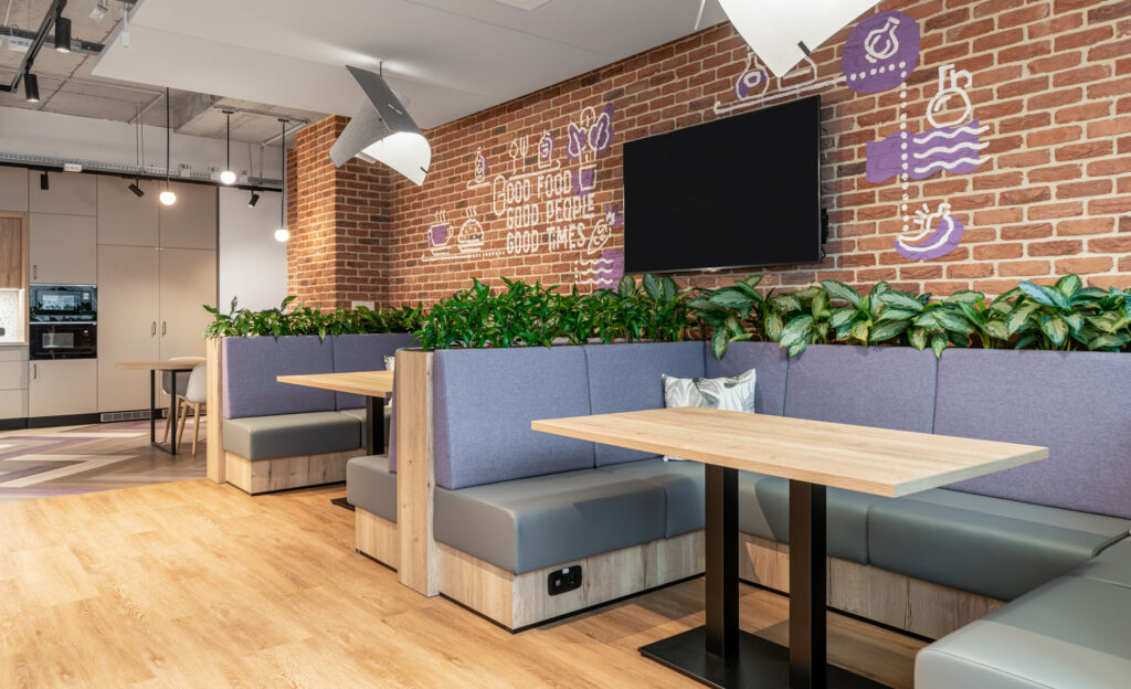
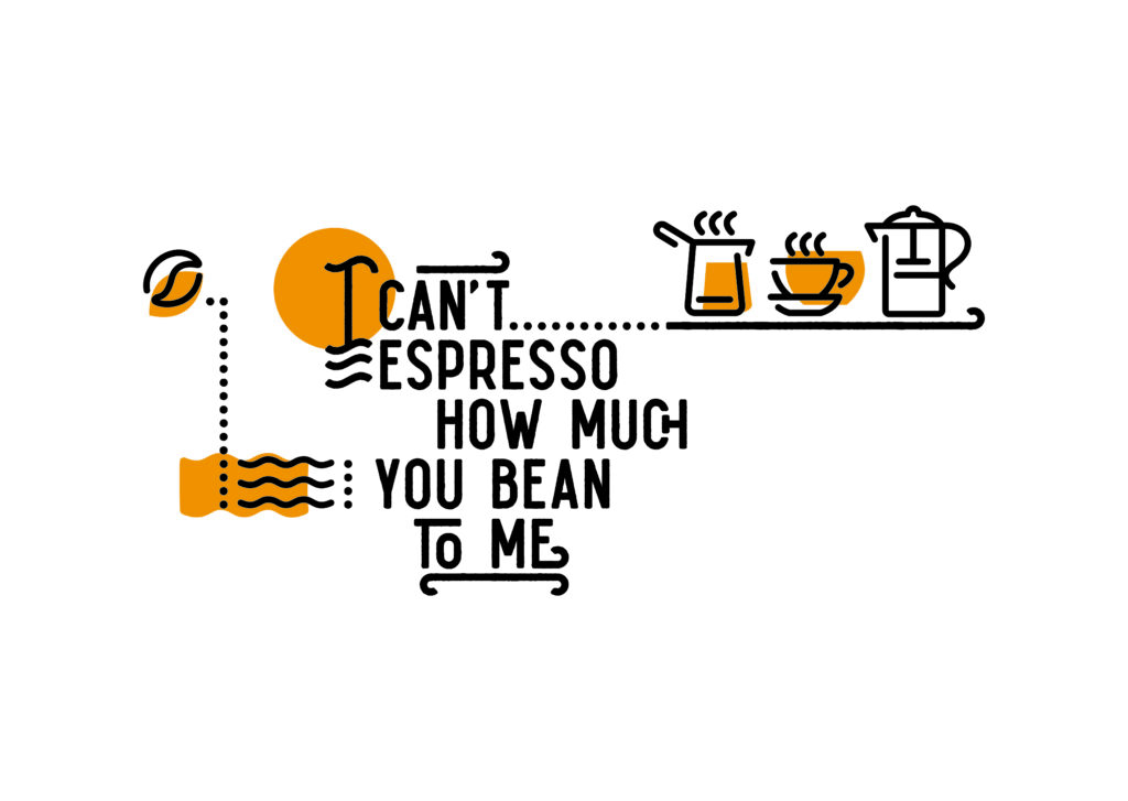
We started with line art based on the interior designers’ sketches. From the very beginning we had to take into account that the graphics would be applied to a rustic brick surface, with painting. This determined the minimum line thickness we could consider. The text content had to be agreed with the bp to reflect them as much as possible, to be personalised. We tried to match the colours to the flooring, but also took into account that a wall surface has a different light and surface quality. Wall graphics were also used in the communal canteens, where they had to support the interior design intention of lifting out the people from the office atmosphere. Make it feel more like an urban café.
The workflow
We put the first ideas into a visual plan to see what would work in the space. We experimented with the proportion of linear and solid areas. When we came up with the idea of displaying proverbs on the walls, we looked for a suitable font for them and then looked at how to make them more graphic. Meanwhile, we drew pictograms to match the theme and then looked at how we could add colour to the composition.
Typographics
Graphics based on typography have been created in a calligraphic style, mixed with icons and textual content specific to the function of the space. They are colour coded to match the colour coding of the room. The style of the graphics, with its curved, interlocking lines, suggests comfort. At the same time, the ‘artisanal’ character of graphic communicates well with the raw brick wall cladding. Figuring out the content is never easy, as it is a multi-participant process and the message should be very strong. As these were the basis for the graphics, this was a critical point.

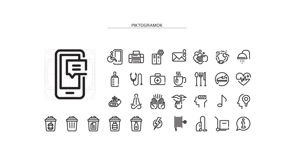
A design that is easy to understand and read. The meaning of the icons has been individually defined to reflect as closely as possible the character of the company.
Signage
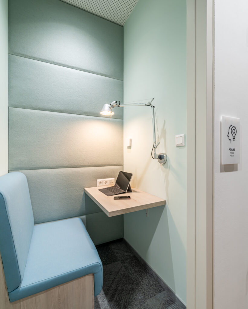
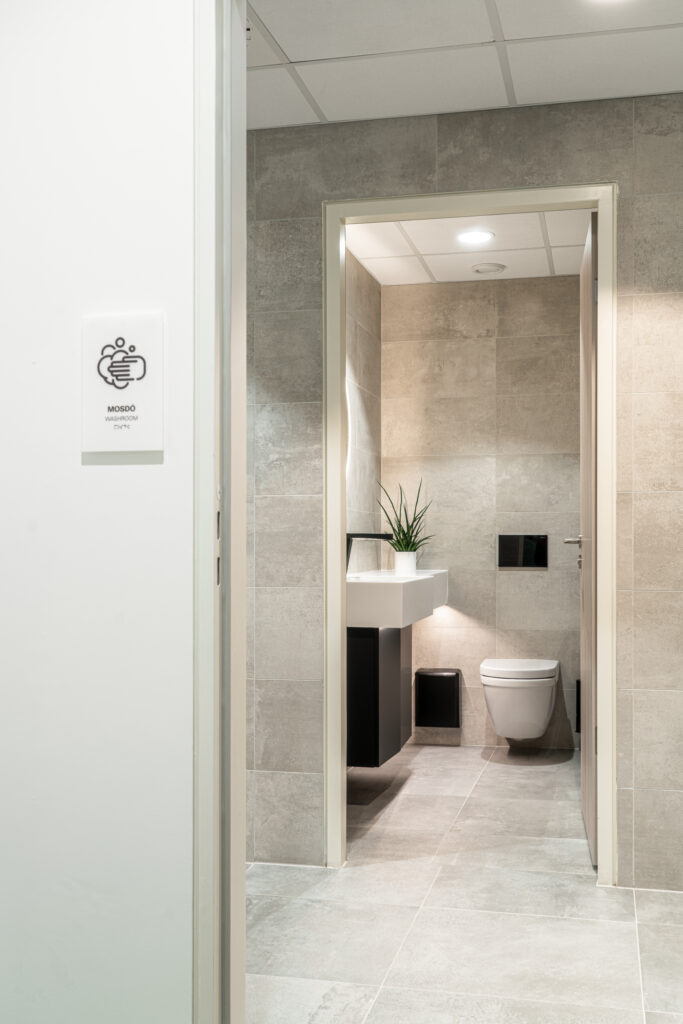
It was designed to match the company’s grand identity, but the design has been further adapted to suit the interior of the office. The pictograms were designed using a uniform grid system. Linearity is the dominant feature, which has been edited with a uniform line thickness.
Discretion foils
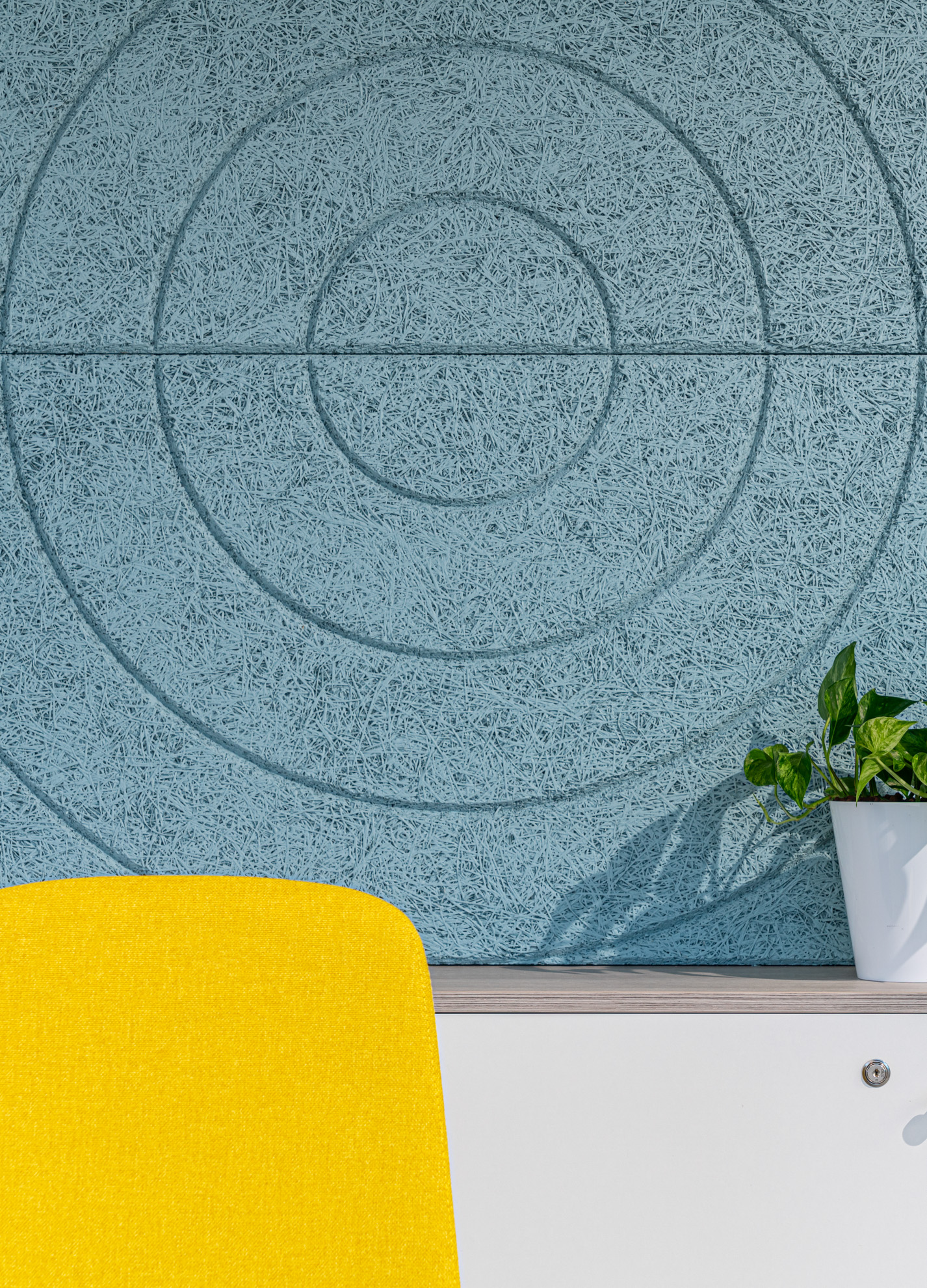
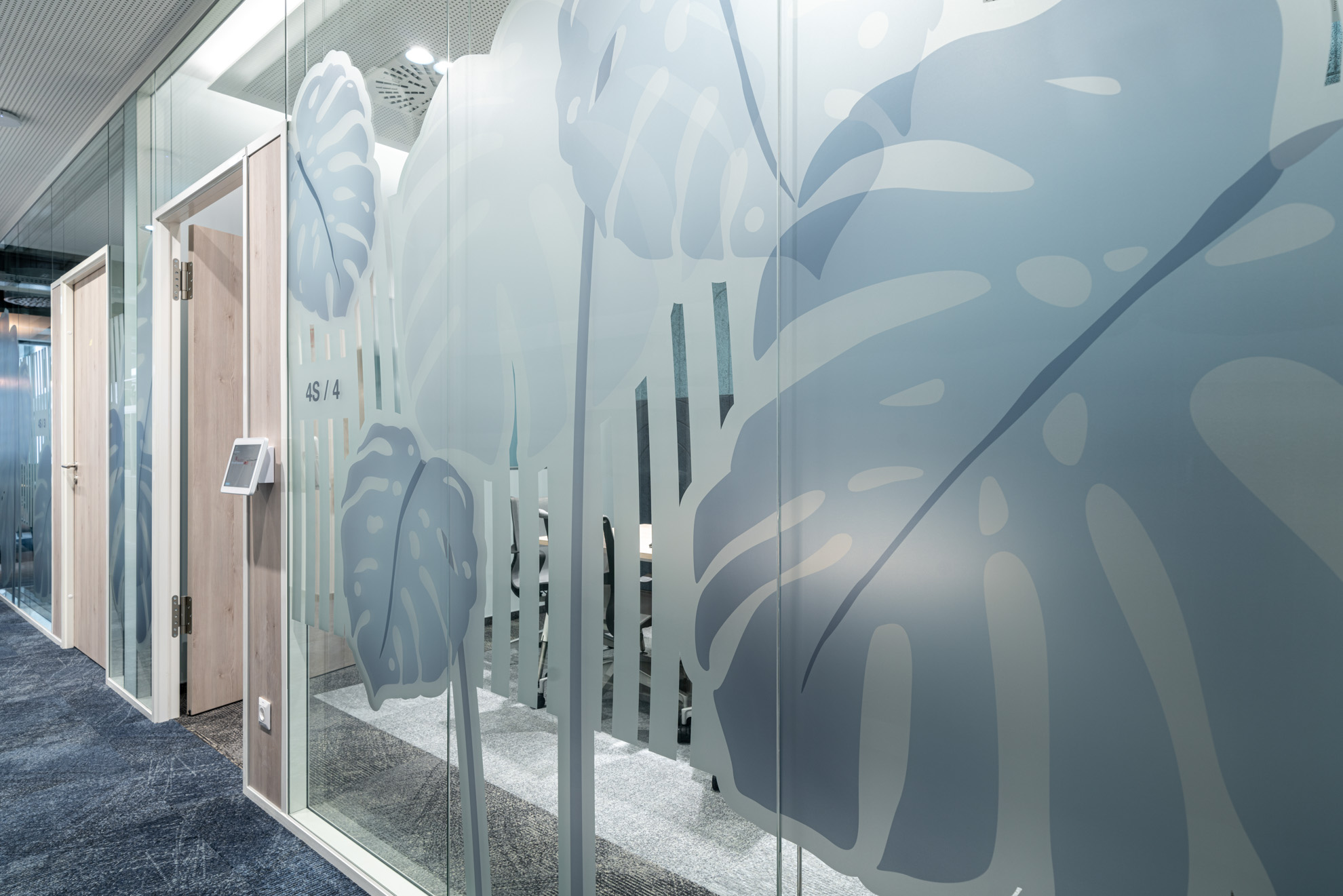
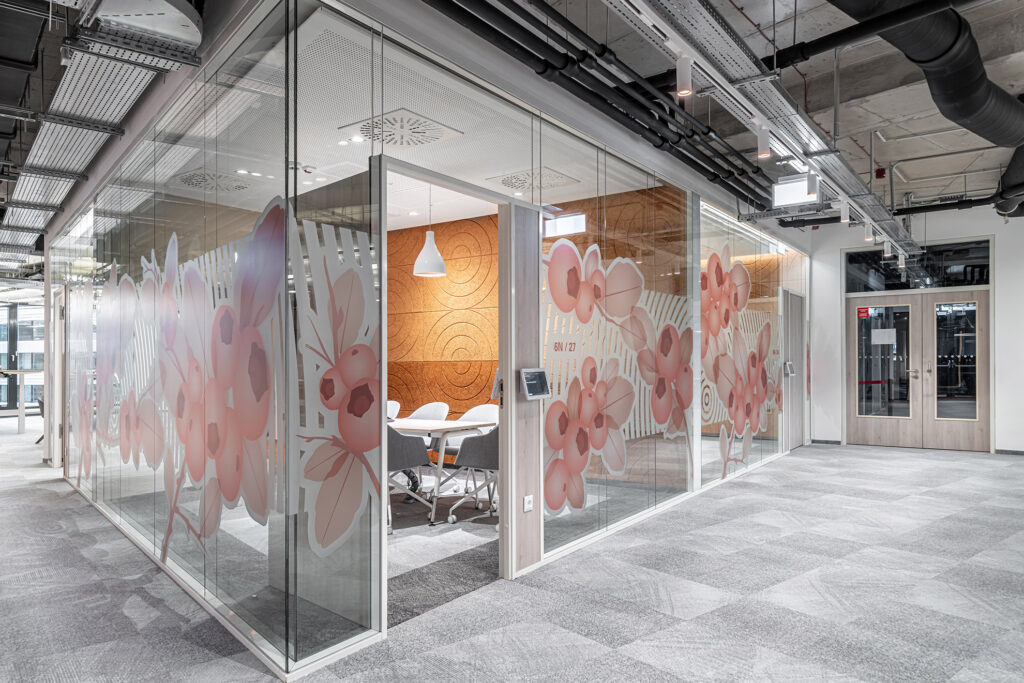
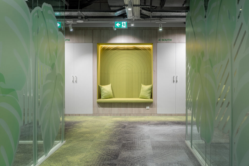
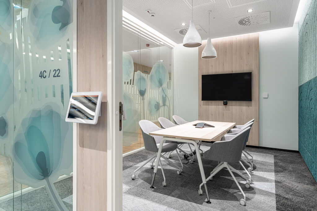
The concept was based on the need to distinguish 3 wings: north-east, central, south-east, each covered with a European plant. Their colouring was given by the coding of each level. It was important to ensure that the graphics would obstruct the view into the meeting rooms. To do this, we used a geometric design inspired by the pattern of the acoustic panels in the room.
It took several attempts to find the right northern plant to be representative enough and to cover the view well. There were junipers and pines, but they were too “prickly”. So we finally settled on cranberries.

