Petőfi permanent exhibition
To be or not to be a poet
Petőfi permanent exhibition
To be or not to be a poet
In a nutshell
It’s thrilling to design an exhibition installation. Especially when it’s about Petőfi Sándor and the permanent exhibition dedicated to him, which 25,000 visitors will see every year… Excitedly but confidently, we embarked on this year-and-a-half-long process, which was a joyride!
Category:
Client:
Designed:
2021-2022
Built:
2022
Creators:
- Mag Ildikó – lead designer
- Alvégi Lóci – visual, interior design
- Eke Tomi – concept creation
- Kecskés Luca – architecture
Partners:
- Kalla Zsuzsa, Prágai Adrienn, Vaderna Gábor – curators
- Samu Bence – media designer
- Szmolka Zoltán – brand identity, graphics
- Minkó Mihály – data physicalization
- Torter – contractor
Photos:
- Bujnovszky Tamás
- Birtalan Zsolt
Publications:
Recognitions:
- Exhibition of the year 2023 – Nominee
Petőfi permanent exhibition
It’s thrilling to design an exhibition installation. Especially when it’s about Petőfi Sándor and the permanent exhibition dedicated to him, which 25,000 visitors will see every year… Excitedly but confidently, we embarked on this year-and-a-half-long process, which was a joyride!
Category:
Client:
Designed:
2021-2022
Built:
2022
Photos:
- Bujnovszky Tamás
- Birtalan Zsolt
Creators:
- Mag Ildikó – lead designer
- Alvégi Lóci – visual, interior design
- Eke Tomi – concept creation
- Kecskés Luca – architecture
Partners:
- Kalla Zsuzsa, Prágai Adrienn, Vaderna Gábor – curators
- Samu Bence – media designer
- Szmolka Zoltán – brand identity, graphics
- Minkó Mihály – data physicalization
- Torter – contractor
Publications:
Recognitions:
- Exhibition of the year 2023 – Nominee
Design Task
As interior designers, our usual task is designing the “home” of a family or a company. However, this time, we had to create space for the art of our country’s most popular poet. WOW. OMG. WTF. YOLO. Let’s get into it and tell you how the work went with Mag Ildi, who pulled us into this truly special project.
Curatorial Concept
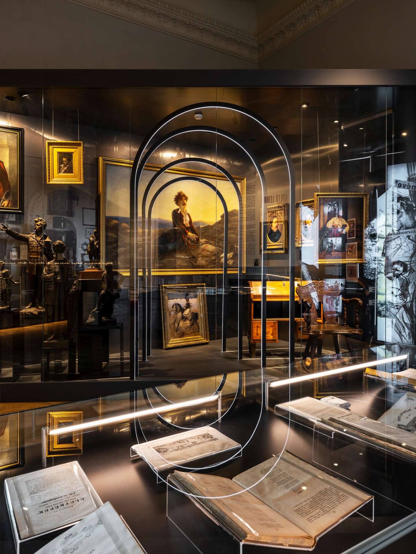
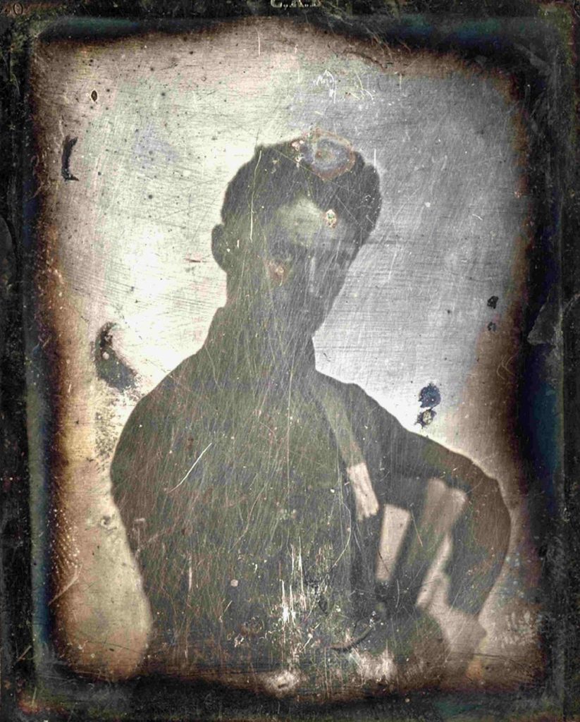
The exhibition is at the Petőfi Literary Museum, curated by the country’s top literature historians, Petőfi experts, and museologists: Kalla Zsuzsa, Vaderna Gábor, and Prágai Adrienn. The curatorial concept didn’t rely on the commonly used biographical editing, nor did it focus on the canonized works. Its intention was to reveal the previously unknown sides of this incredibly short but profoundly deep body of work, as we see and feel its impacts today.
Location
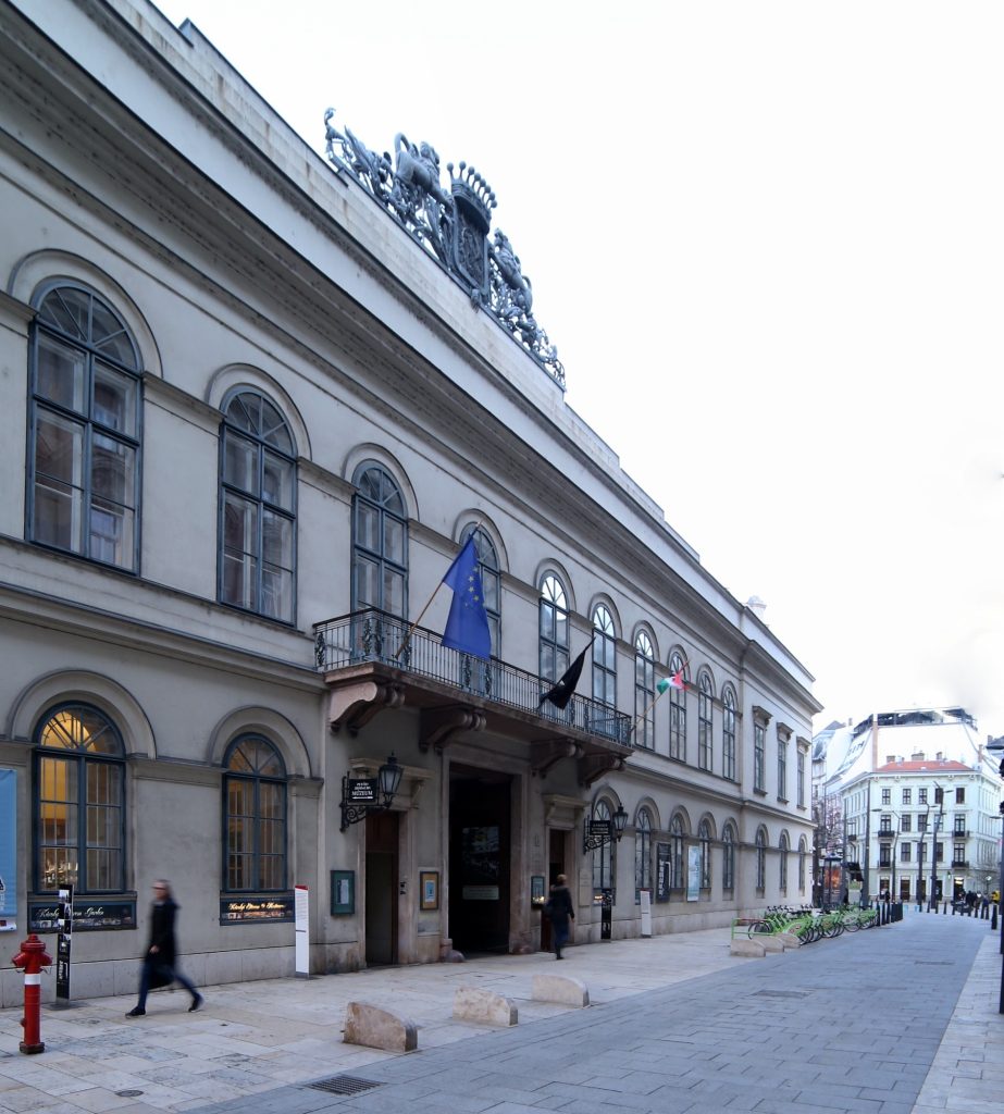
The Károlyi Palace, hosting the Petőfi Literary Museum, has been home to the “Petőfi Permanent Exhibition” since 1959. These elegant chambers were our playground here. Moreover, during the exhibition planning, most of the palace underwent renovations. It was an advantage for us as we could participate in the finalization of electrical and mechanical layouts. However, it posed a disadvantage as the renovations ran behind schedule, putting pressure on the exhibition execution. There were times when we held our regular Friday meetings in the grand mirrored room at 15 degrees Celsius 🙂
Metal and Horizon
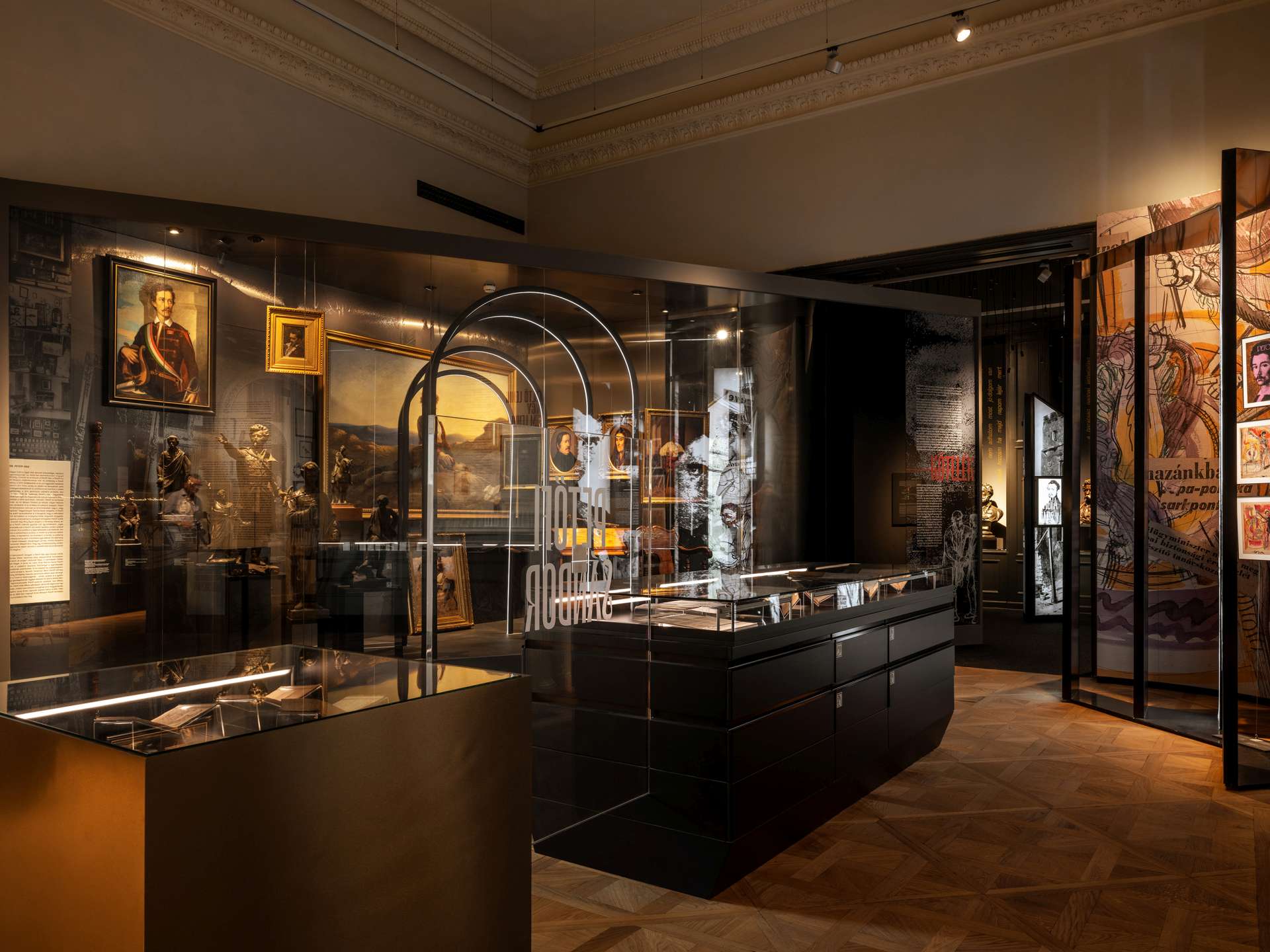
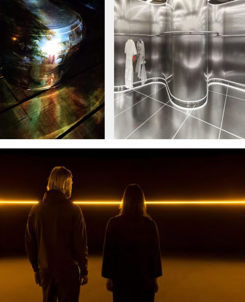
We based the visual backbone on two strong elements. The first is the use of metal. We felt that different forms of steel (rusty, polished) were excellent visual metaphors for Petőfi: strong, combative, wild, dramatic, yet beautiful. As seen in the concept sketches, we planned to cover almost every significant installation with steel plates. We even experimented with steel projection, which showed promising results at the time.
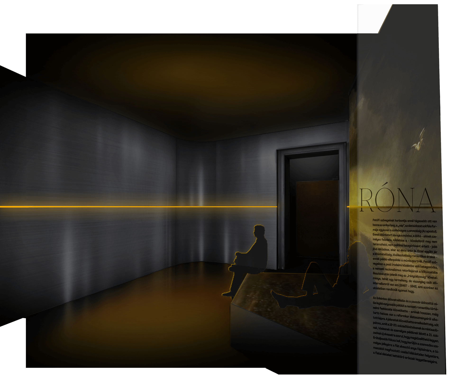
The second significant visual element was the horizon line. In museology, the approximately 150 cm eye level is crucial, and we easily connected this with the horizon dominating the plain.
Intro & Theme Rooms
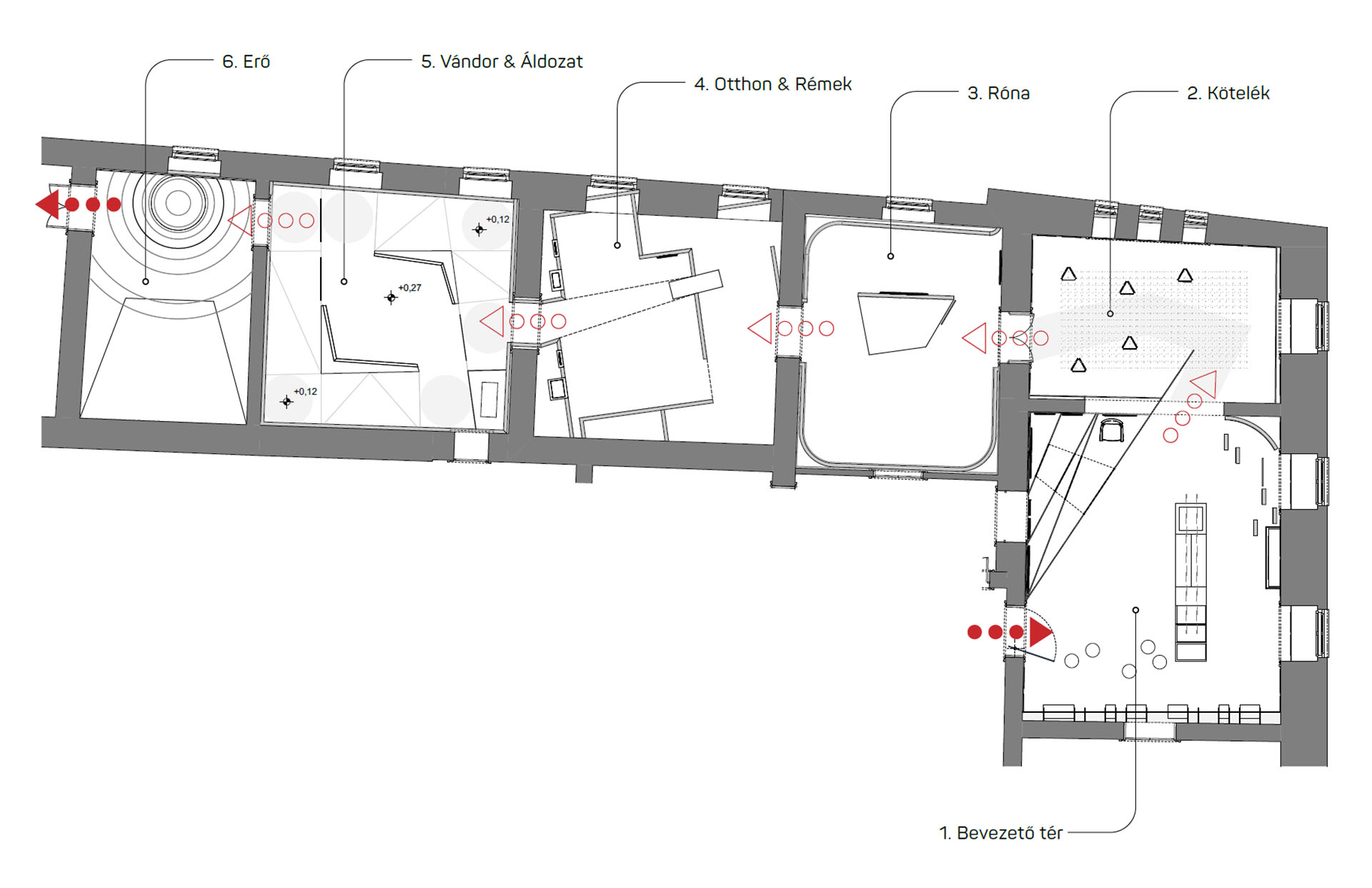
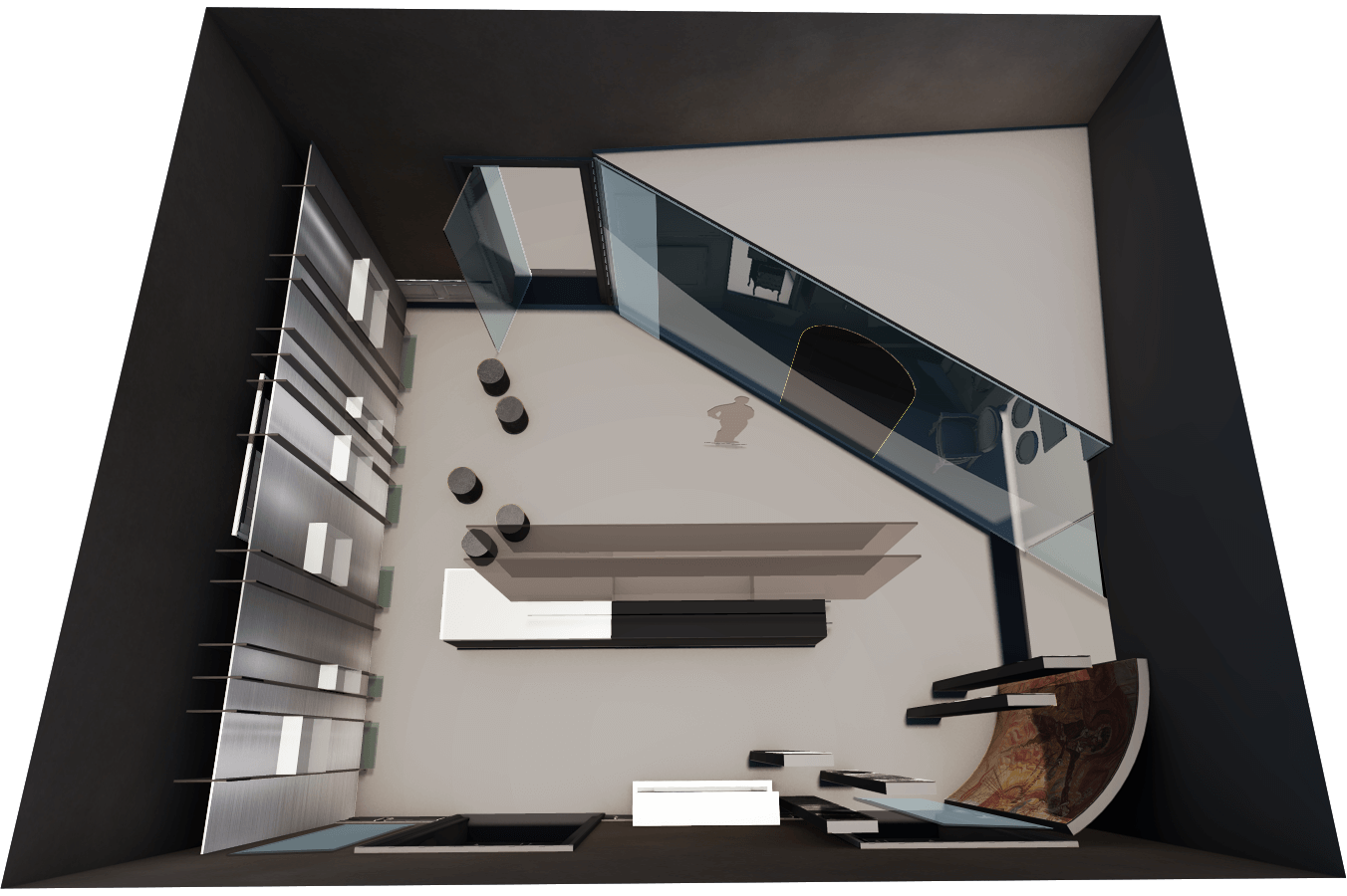
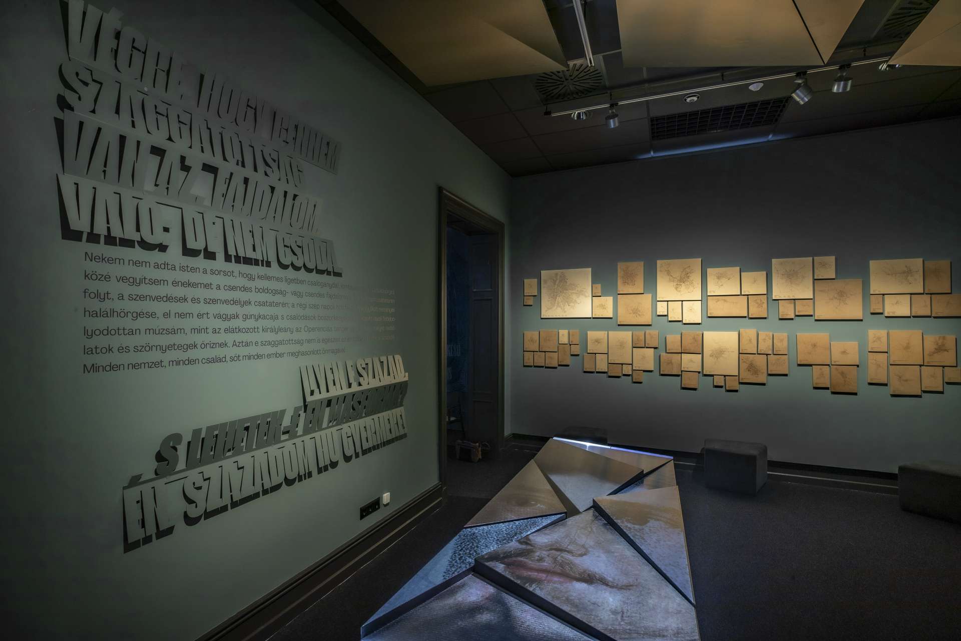
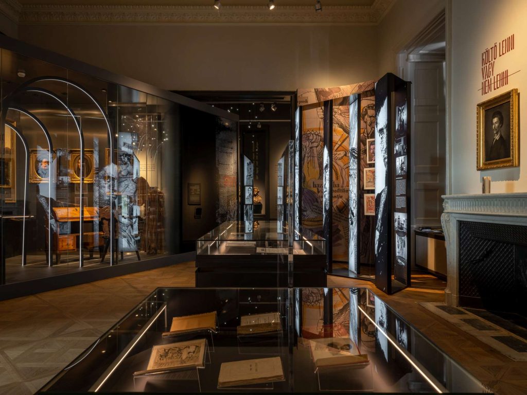
The use of space is very modern. The “most museum-like” space is the first introduction room, where, alongside a biographical wall, most artifacts find their place, next to two corners reminiscent of significant past exhibitions. In the five additional rooms, Petőfi’s poetry is presented thematically: Connection, Plain, Horrors, Home, Sacrifice, and Power.
Connection
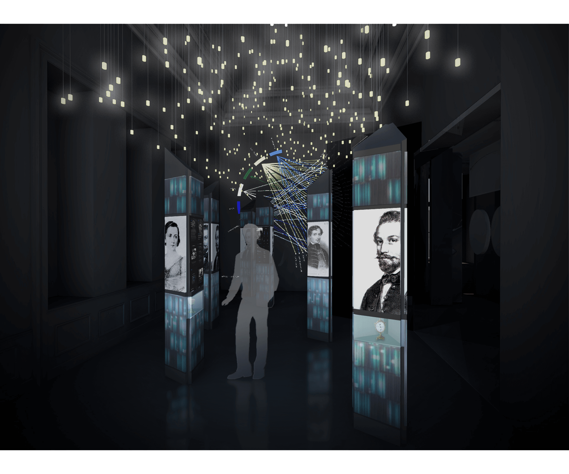
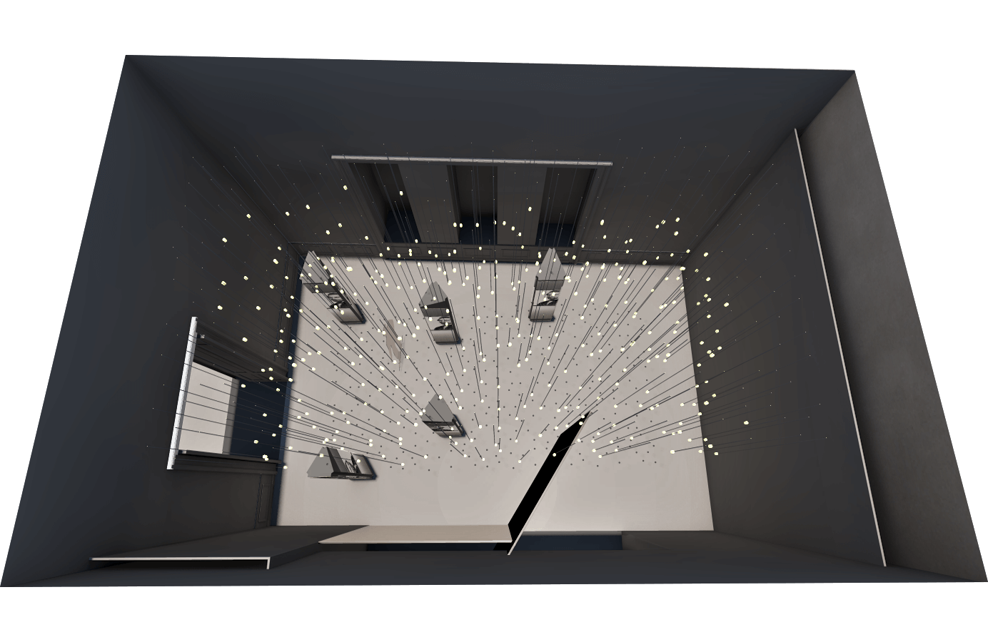
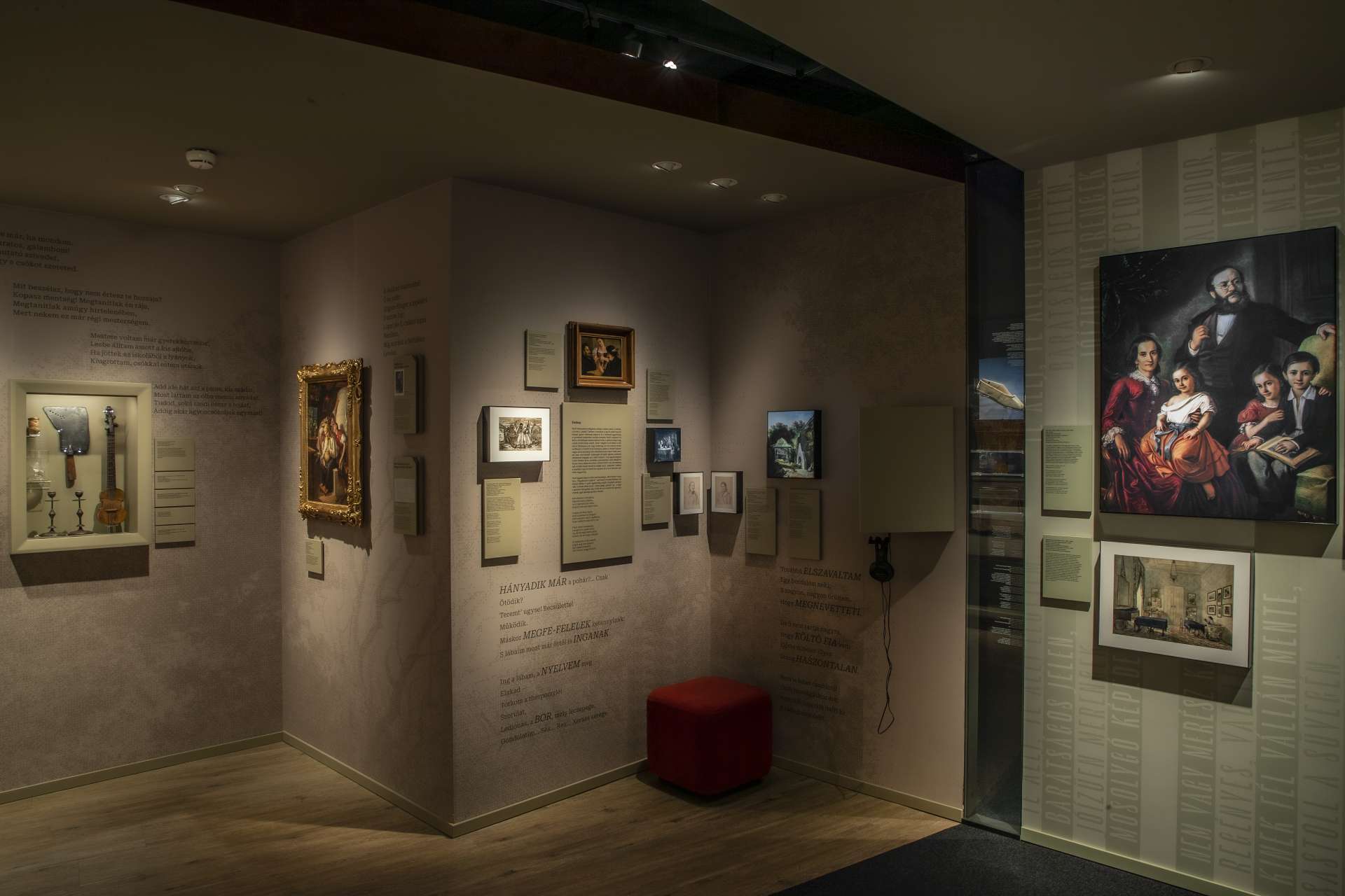
The first thematic room presents Petőfi’s network of connections, the network of acquaintances and loved ones. The visual concept clearly resembled a night forest under a starry sky. Under the pulsating light installation, we can read about his most important connections on illuminated totems, hiding particularly important artifacts. When entering the room, all columns “turn towards us” with familiar faces, and the busts are placed on individually height-adjusted bases to match our eye level.
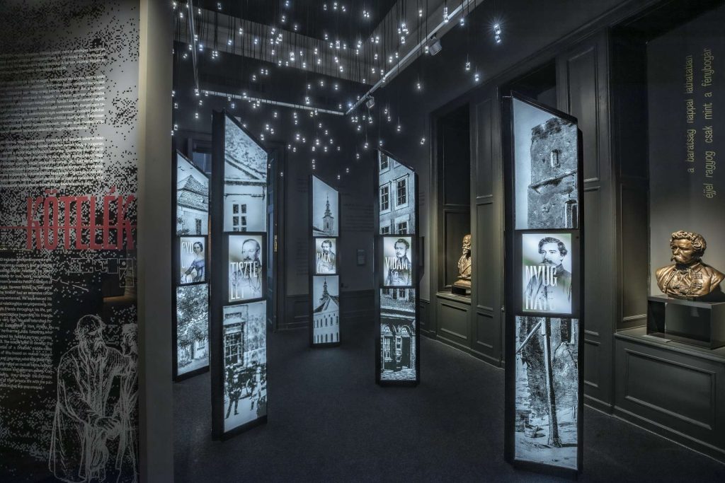

“As many friends have I, as there are stars in the sky above.”
Petőfi Sándor
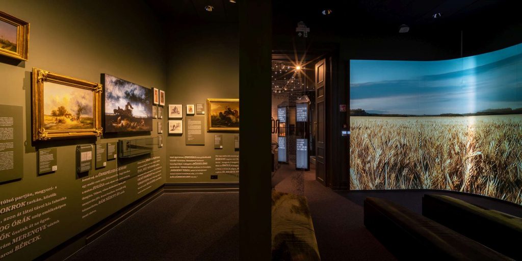
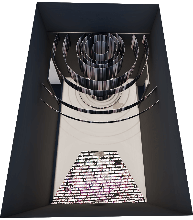
Plain
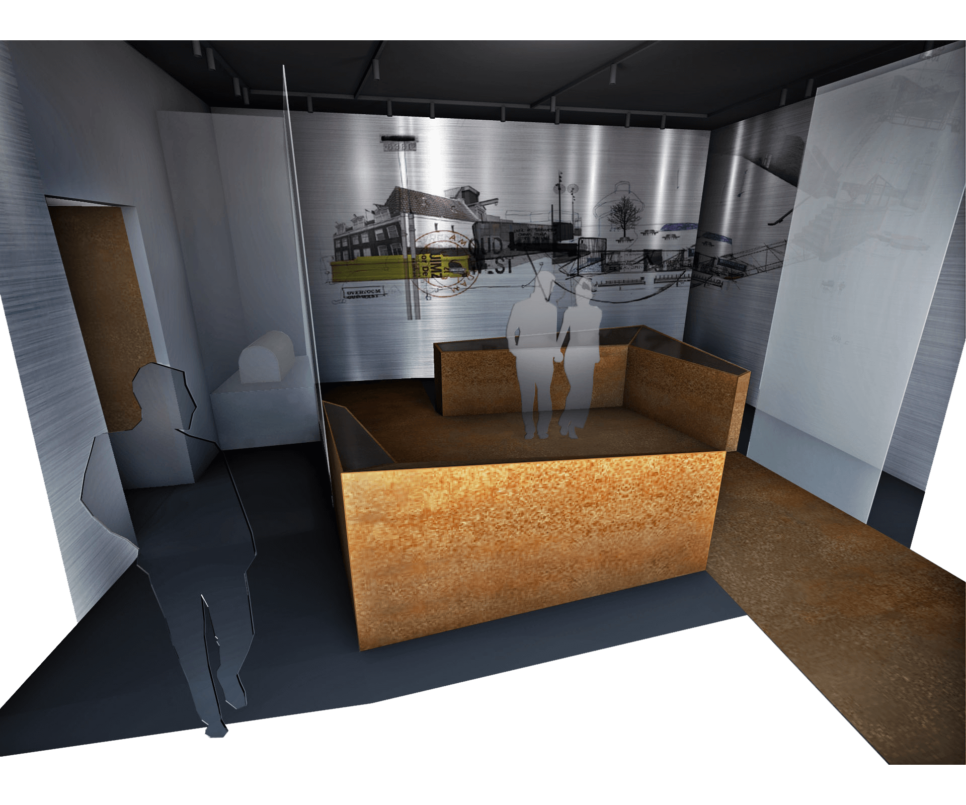
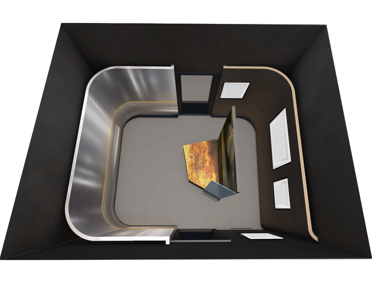
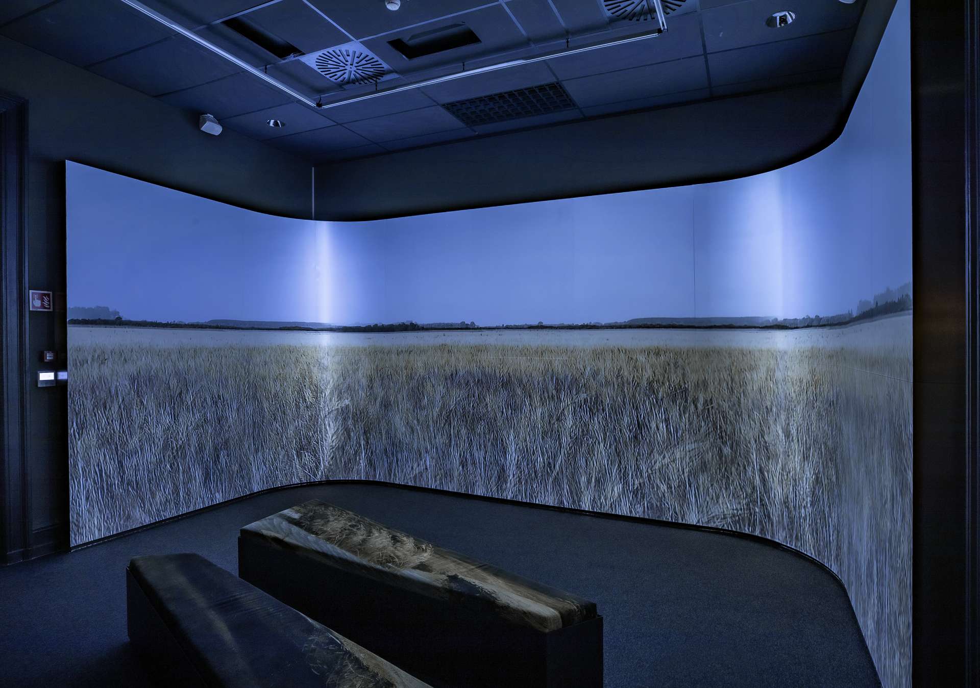
The infinite landscape is painted for us in a rounded 180-degree panorama projection by Samu Bence, the media designer of the exhibition. Unfortunately, during the development of the visual material, it turned out that the brushed steel did not fit as a background for this projection. Although the originally envisioned animation-rich images with a contrasting background provided beautiful depth to the metal surface, the final form of the video killed the details of the rich nature images. Therefore, we had to apply decals to the cover afterward…
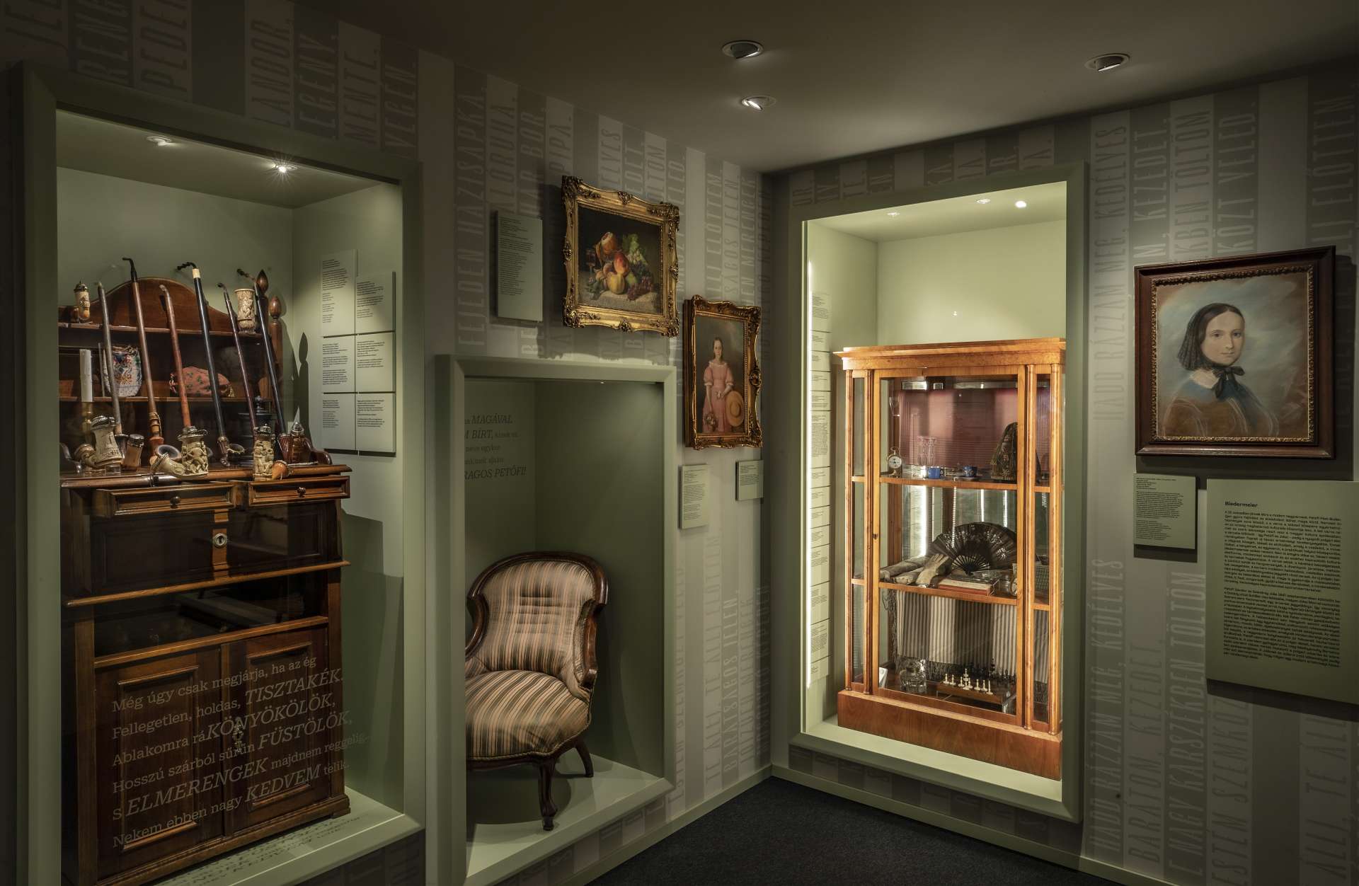
Horrors – Home
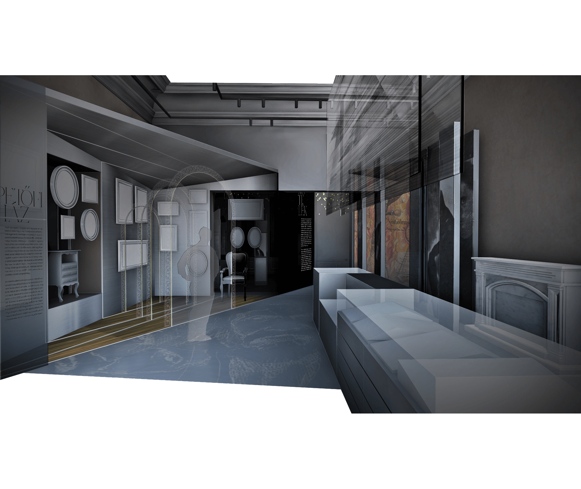
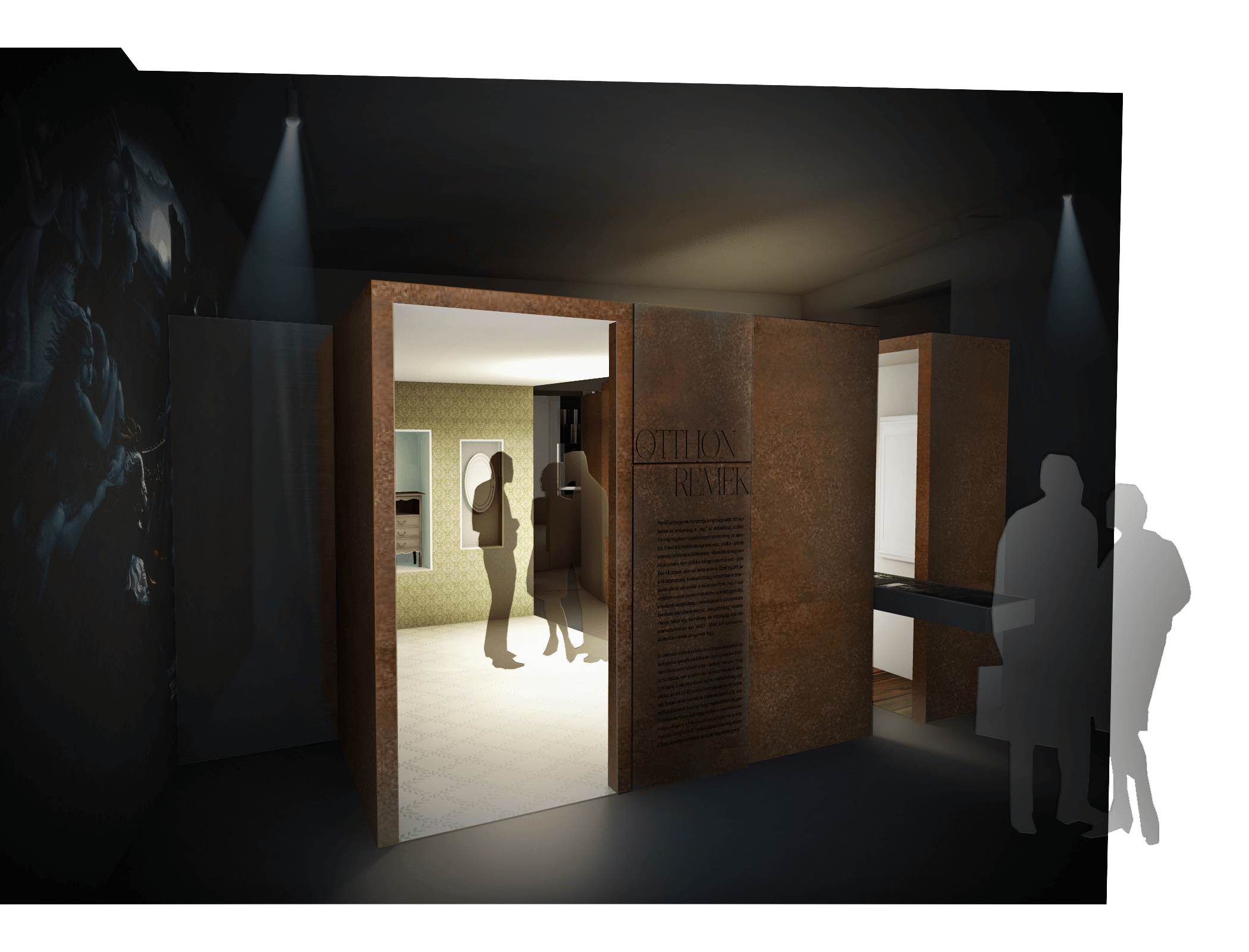
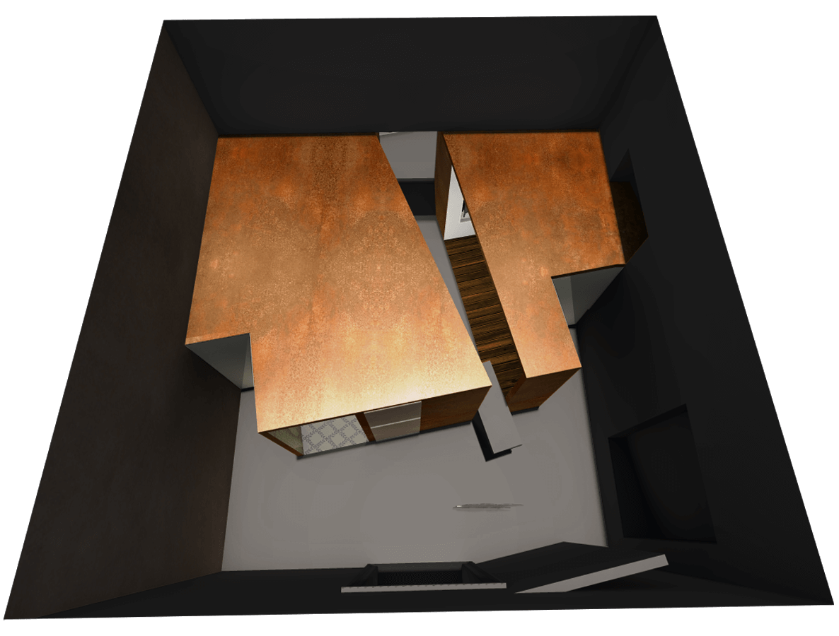
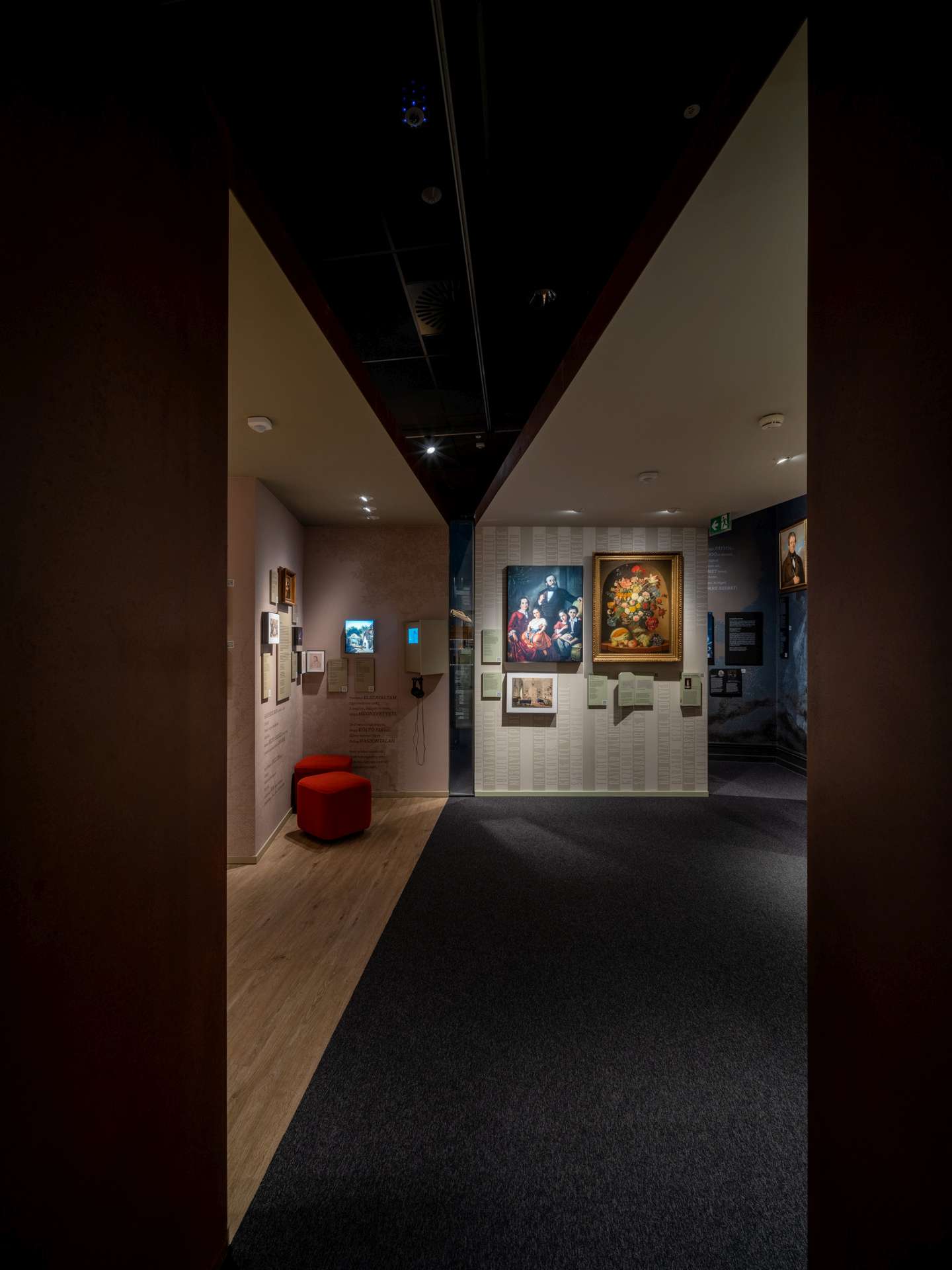
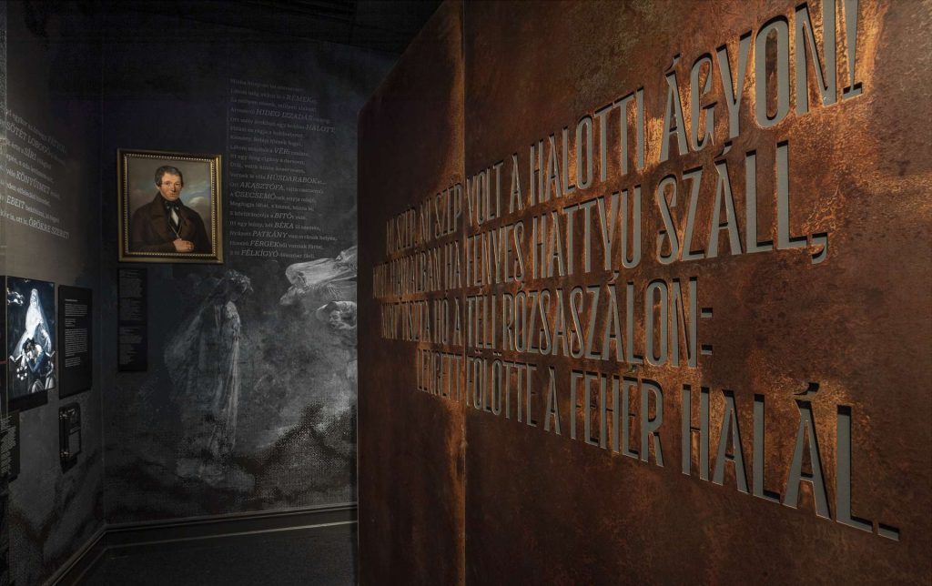
The curatorial concept in this room aimed to present the duality of two themes. Therefore we practically provided a “space within a space” architectural response from the very beginning. We went through several variations of this idea, and it finally persisted until realization. The exterior space explores the themes of horror, romance, dark, cold landscapes, while the interior space revolves around Biedermeier, urban warmth, and coziness. We also split the internal box with a fissure. Which, on the one hand, further divides the interior into two topics. On the other hand, leads to the next room.
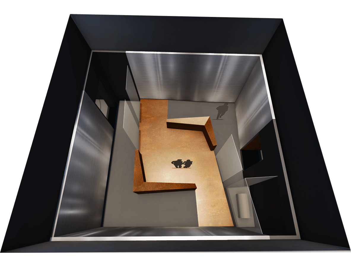
Sacrifice
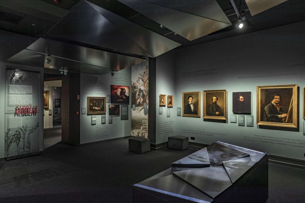
In addition to the topics of sacrifice and becoming a victim, this room also covers Petőfi’s travels. Our initial idea was a labyrinth combined with an ascending and descending ramp. Although designing a wheelchair-friendly serpentine space was challenging, it fit within the available space. However, at the request of the museum educators, we had to discard it. The professional aspect was that each room had to accommodate a school class at once, as they constitute the majority of visitors! Due to the cold and oppressive themes, we eventually used the form of a winter ice sheet congestion here.
Power
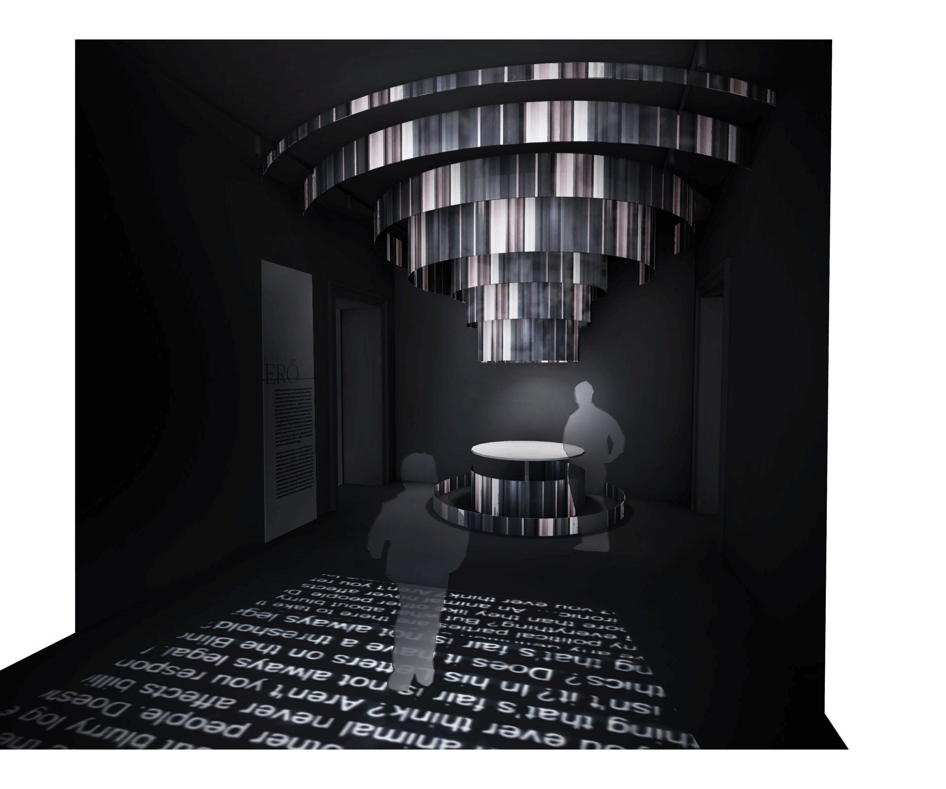
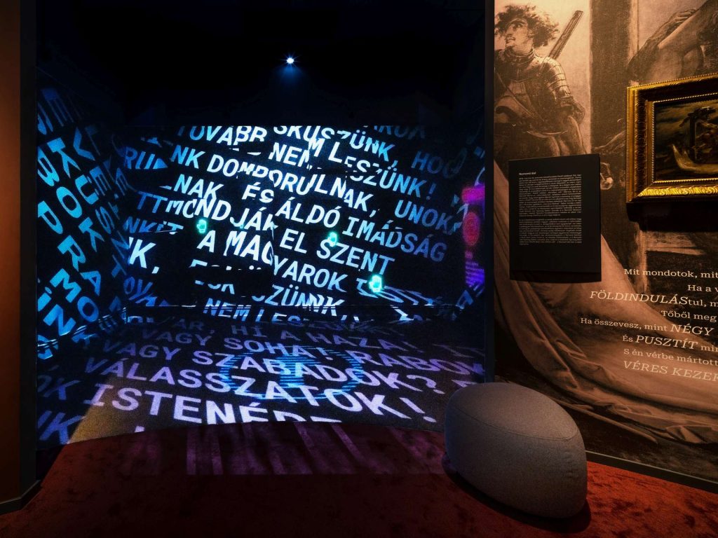
The smallest room with the most content! 🙂 Petőfi’s revolutionary poetry, the appearance of violence in literature, and the installation depicting the spread of the Petőfi cult find a place in just 34 square meters. At the center is the Pilvax table. Also the playful-interactive space intended as the closing chord of the exhibition, with four different games.
Design – Procurement – Execution
The various phases of design took a total of one and a half years. The visuals developed weekly in sync with the content during curator meetings. It was our first time participating as designers in a procurement process. Because of this we prepared a detailed tender plan with an itemized description between the sketch and execution plans. However, due to the prolonged procurement process, we had an unhealthy amount of time, only 3-5 months, to work with the contractor.
This time frame included preparing manufacturing plans, coordinating them, and the actual execution… madness. Unfortunately, this led us to bite our hands several times. The fourth or fifth time I visited the finished space, I finally noticed on myself that I no longer just saw the mistakes. 🙂 The exhibition is expected to be open for nearly 10 years. Check it out, and let’s chat about it!

