

Cleanest Systems
A container-full of pure expertise - brand launch from identity to container lab.
Cleanest Systems
A container-full of pure expertise - brand launch from identity to container lab.
In a nutshell
Cleanest Systems approached us with no small task: to support the development of their modularly customizable OASIS TC (Technical Cleanliness) container lab and cleanroom concept, along with its accompanying NASOS industrial cleanliness testing equipment through graphic design, interior architecture, and construction consultancy. As a starting company, all of this was then forged into a distinct brand identity for their debut before an industry audience at Hungary’s Industry Days 2026 exhibition. It was a thrilling journey to be able to create value and identity hand-in-hand in the domain of industrial science.
Category:
Client:
Cleanest Systems
Designed:
2025-26
Built:
2026
Creators:
- Lóci Alvégi – Container Interior Design, Construction Advisor, PM
- Csaba Kálmán – Branding & Identity, Graphic Design, Container decor, Webdesign
- Kati Bessenyei – Logo animation
Partners:
- Péter Gordon, PhD, Péter Naszádos, Péter György T., Zsolt Radványi, Márk Groó – Client Consultants, Founders
- Zsolt Nagy – Web development
- Kontex Ltd. – Container Construction
- MEDI-TERVILL Ltd. – Container Interior Manufacturer
- GYULAI FAFÉM BÚTOR Co. Ltd. – Container Furniture Manufacturer
Photos:
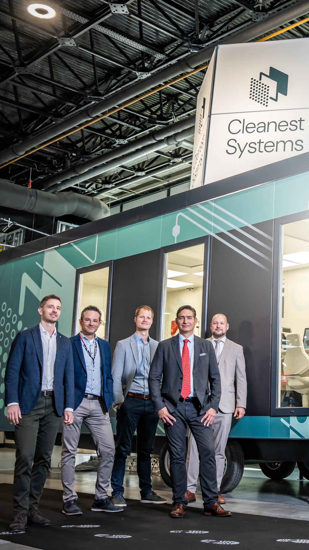
- Eszter Gordon – Industry Days 2026 group photo
- Unsplash photos
Cleanest Systems
Cleanest Systems approached us with no small task: to support the development of their modularly customizable OASIS TC (Technical Cleanliness) container lab and cleanroom concept, along with its accompanying NASOS industrial cleanliness testing equipment through graphic design, interior architecture, and construction consultancy. As a starting company, all of this was then forged into a distinct brand identity for their debut before an industry audience at Hungary’s Industry Days 2026 exhibition. It was a thrilling journey to be able to create value and identity hand-in-hand in the domain of industrial science.
Category:
Client:
Cleanest Systems
Designed:
2025-26
Built:
2026
Photos:
- Eszter Gordon – Industry Days 2026 group photo
- Unsplash photos
Creators:
- Lóci Alvégi – Container Interior Design, Construction Advisor, PM
- Csaba Kálmán – Branding & Identity, Graphic Design, Container decor, Webdesign
- Kati Bessenyei – Logo animation
Partners:
- Péter Gordon, PhD, Péter Naszádos, Péter György T., Zsolt Radványi, Márk Groó – Client Consultants, Founders
- Zsolt Nagy – Web development
- Kontex Ltd. – Container Construction
- MEDI-TERVILL Ltd. – Container Interior Manufacturer
- GYULAI FAFÉM BÚTOR Co. Ltd. – Container Furniture Manufacturer


The brand: identity, web, product, space
For the OASIS lab container and the NASOS testing equipment, we had the privilege of shaping both the product and the underlying brand alongside the founder-designers from the very beginning. This was a particularly exciting task in such a specialized field, where scientific precision, industrial expertise, and reliability had to be reflected in every detail of the design.
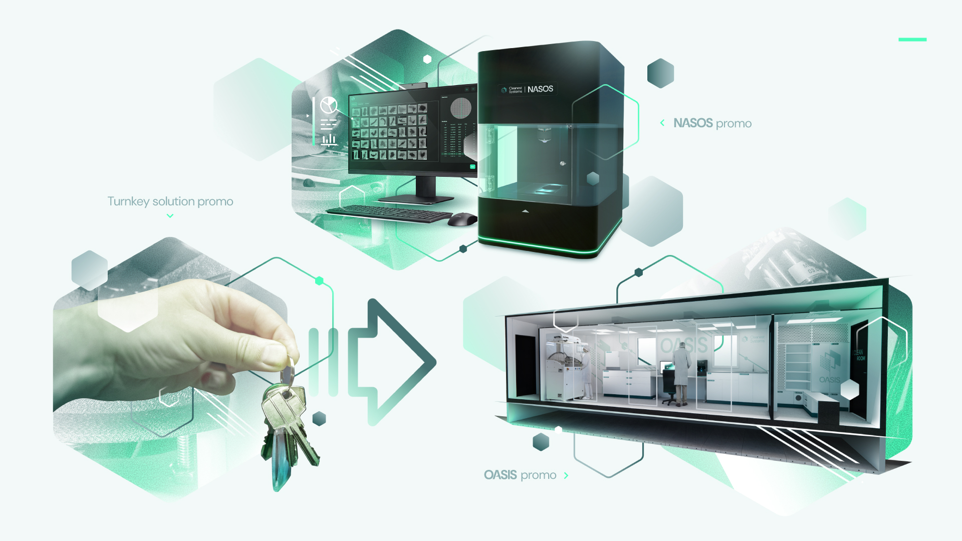
We designed the complete brand identity system from the logo and visual elements all the way to the website, and then extended this same visual language into the interior architecture and exterior design of the turnkey OASIS cleanroom and lab container. In parallel, we also provided UX/UI consulting for the development of the NASOS testing equipment’s interface.
…
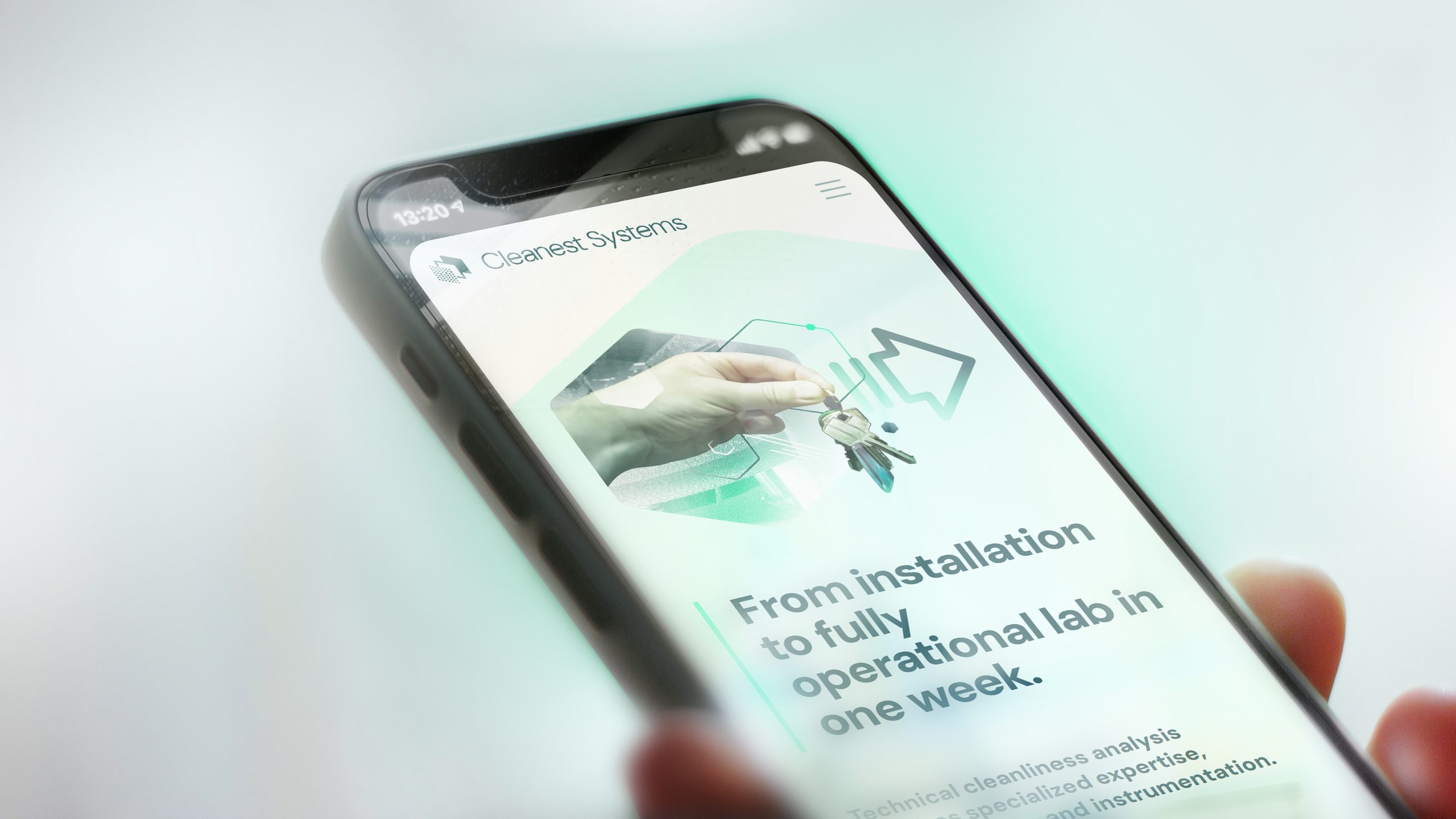
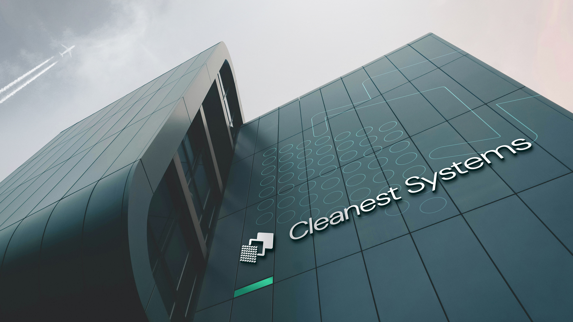
The scientific-grade cleanliness and extensive industrial experience they represent demanded an identity that radiates both precision and reliability, yet it’s also fresh and dynamic, whether encountered on a screen, as a logo, or across the chassis of a container.
The new brand and the OASIS concept ultimately made their public debut to great acclaim at the Industry Days 2026 technology exhibition.
We thrive on projects where different fields of design evolve not sequentially, but hand in hand.

Clean forms, solid structure
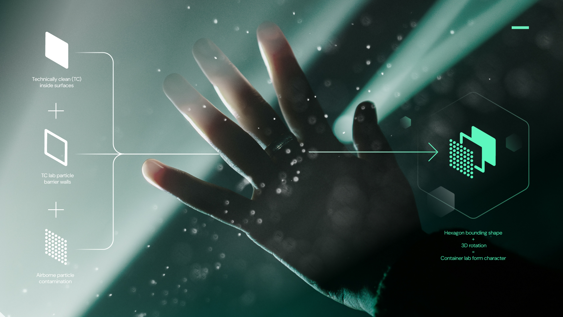
When designing the logo, our starting point was how to capture the operating principle of the OASIS cleanroom within a single symbol: the sharp boundary between the contaminated external environment and the scientifically spotless interior.
We ultimately found the solution in layers. The walls of the cleanroom separate airborne dust particles and contaminants in the outdoor air from the interior and the workpieces. We represented this separation through three stylized layers. This allows the logo to tell a story and integrates the product as a layer without explicitly drawing it.
Tilting these three layers into 3D space gave birth to the emblem. Its hexagonal shapes and angles simultaneously echo the axonometric silhouette of the OASIS container.
…
The Cleanest Systems team believes that the quality of their work expressed through their reliability and precision, must serve as a self-explanatory, stable, and solid foundation in an industrial environment shaped by science, economics, and constant change. We therefore built the identity using a few highly characteristic and focused elements: clean structures, strong contrasts, and harmonizing components.
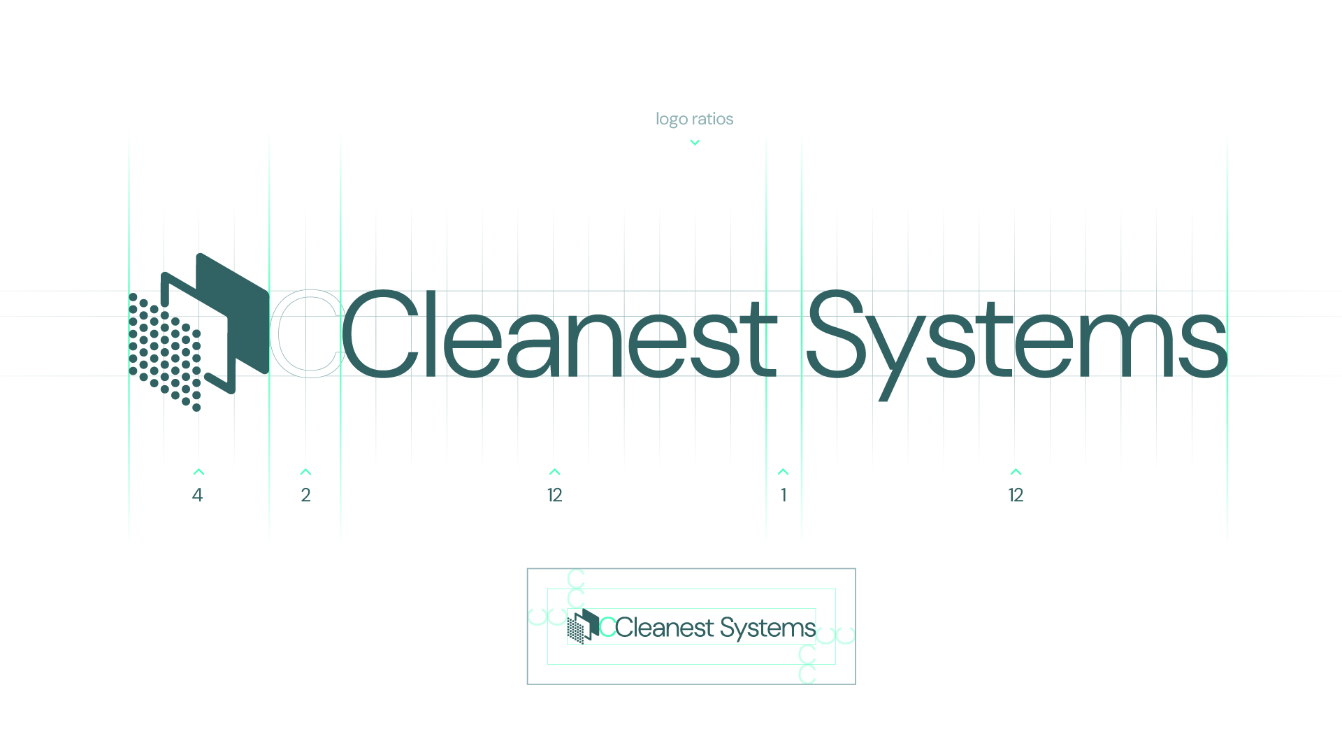
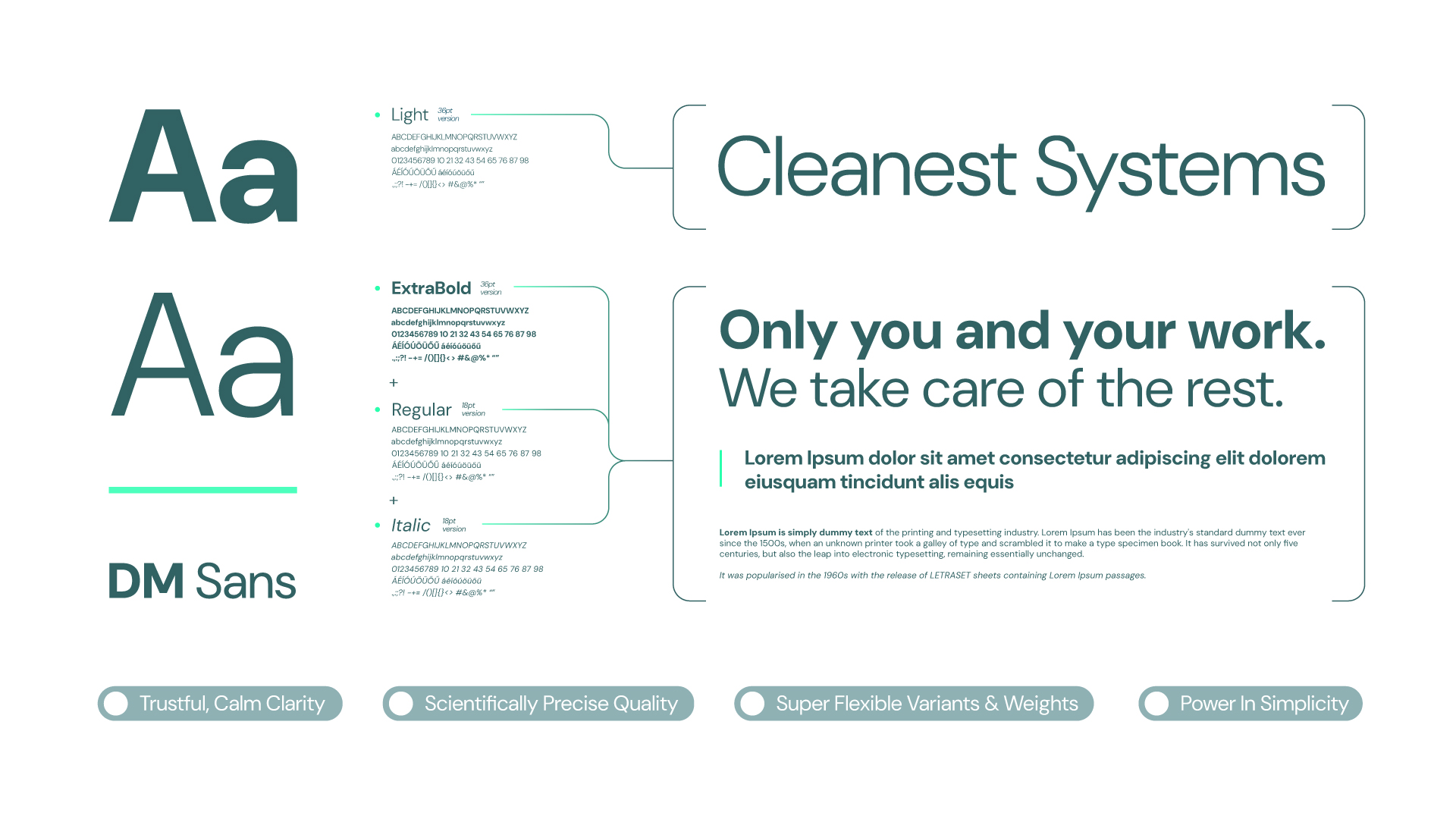
To complement the bold, geometric symbol, we selected the DM Sans typeface. Its subtle details and versatile weights offer an elegant counterpoint to the strong character of the emblem. When animated, the emblem goes through the short narrative of its meaning as the layers come forth and then rotate into 3D space before us, accompanied by an energetic, luminous effect.
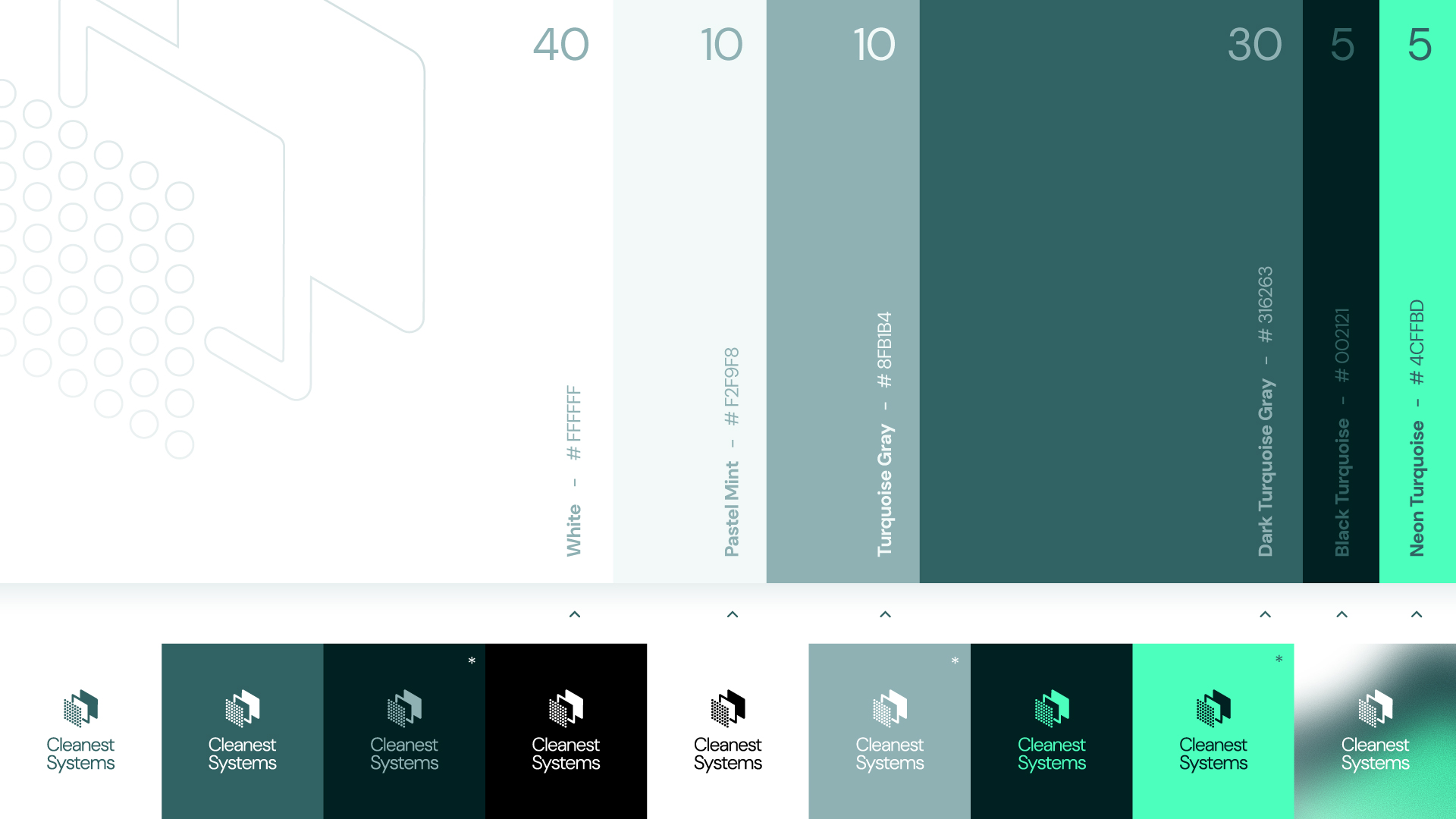
This same contrast defines the color palette. An intense neon turquoise lives alongside the mainly calm, light, greenish tones fitted for purity and a scientific setting, which injects the energy of innovation and forward-looking technology into the brand.
A clean industrial logo fits for the industrial cleanroom.

Power in simplicity
The identity also conveys cleanliness through its opposite: the calmness of expansive, light-colored surfaces is broken by grainy, gradient-filled hexagons. They evoke dust particles floating in space, as seen through a camera lens: some stay in sharp focus, others appear large and softly blurred.
Visually, presence and absence, density and sparsity, thinness and thickness, outlined and filled forms are all contrasting pairs that play on the duality of clean versus unclean, just as the walls of the OASIS cleanroom and lab container physically separate the two as a product.
…
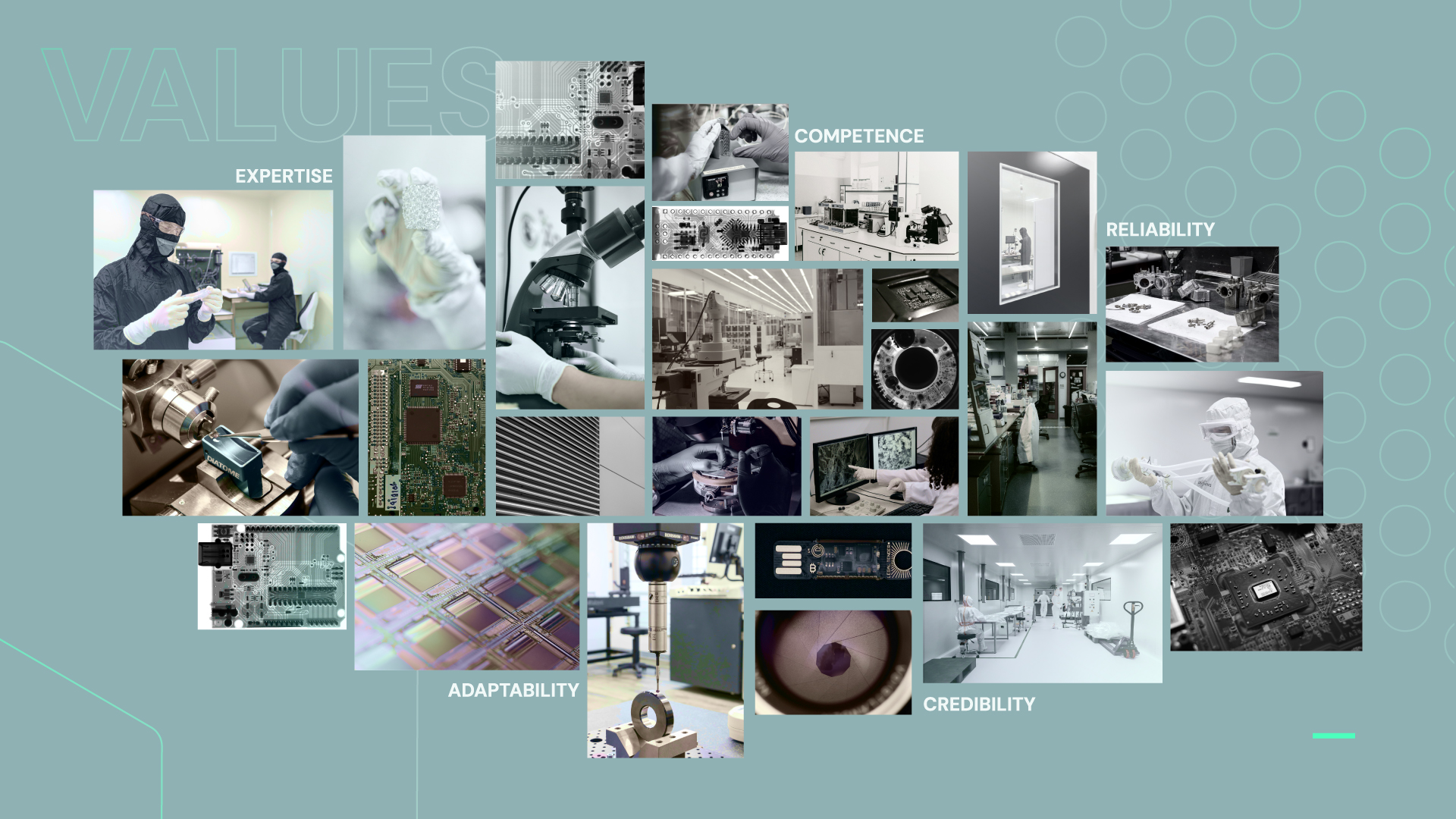
A core value of Cleanest Systems is its professional credibility, anchored by a highly skilled, efficient, and versatile team. Therefore, delivering an elegant, clear, and well-considered aesthetic was paramount when both primary and background brand elements were balanced. The fresh, dynamic gestures that bring momentum into the mix were also set within firm, predictable boundaries.
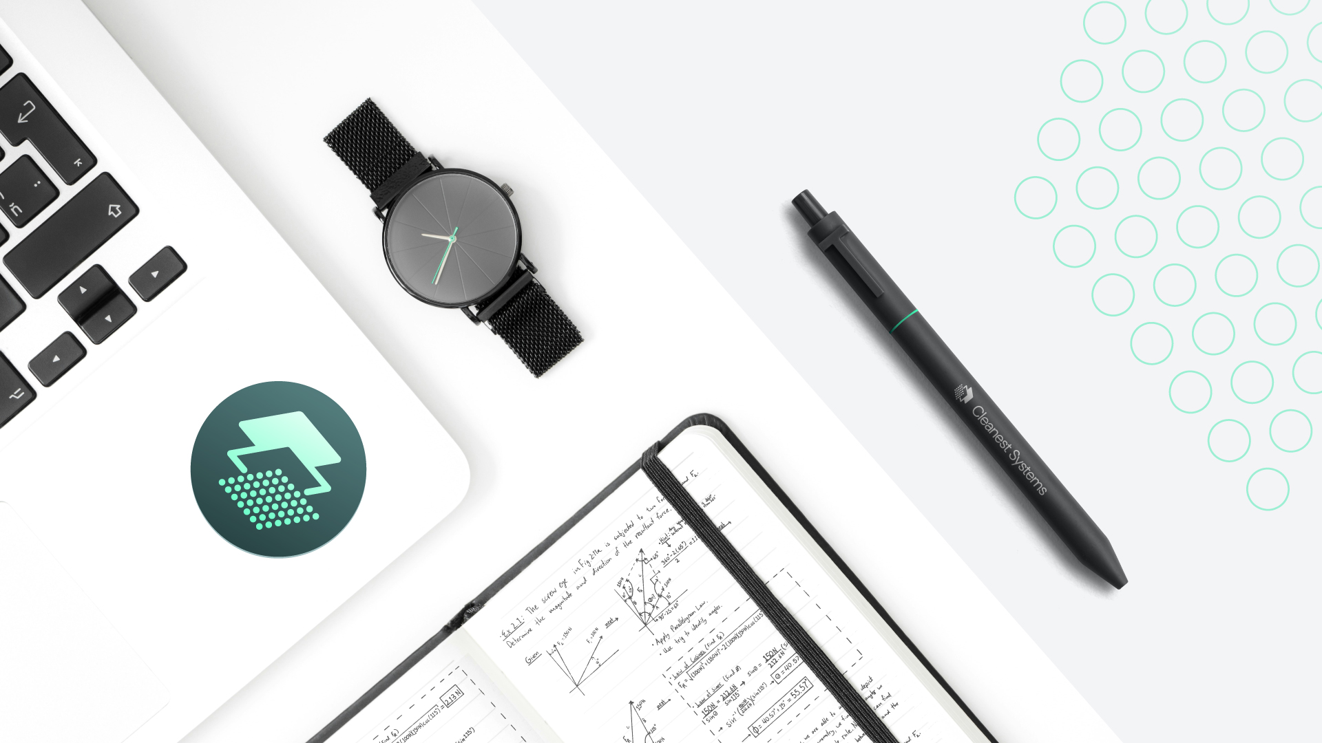
The brand elements offer both vibrant and modest combination possibilities. This flexibility allows the identity components and typography to be applied across a wide variety of touchpoints with an open, airy layout, while still leaving room for strong accents and striking visual moments.

…
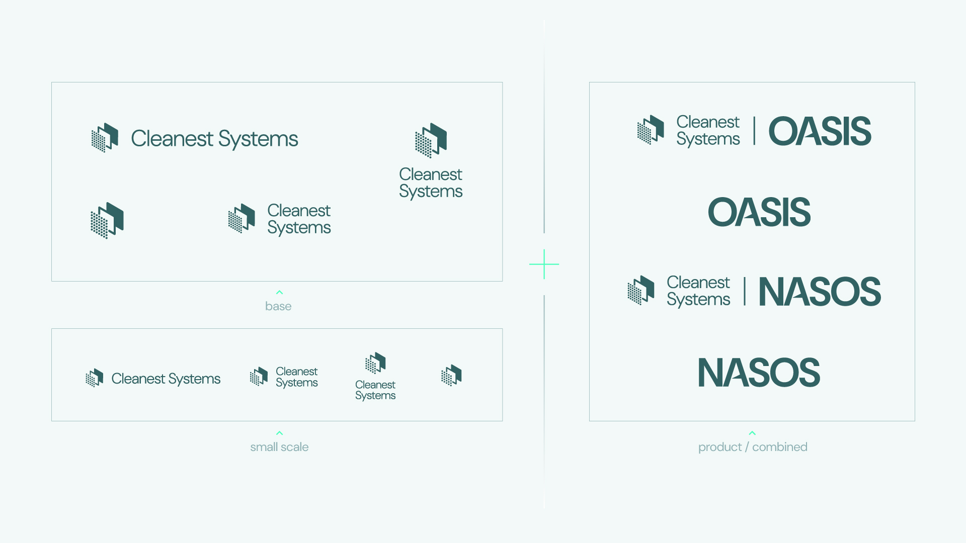
In primary communications, the identity follows a more direct, to-the-point line, whereas for the product itself and its graphics, it can adopt a looser, more forceful expression.
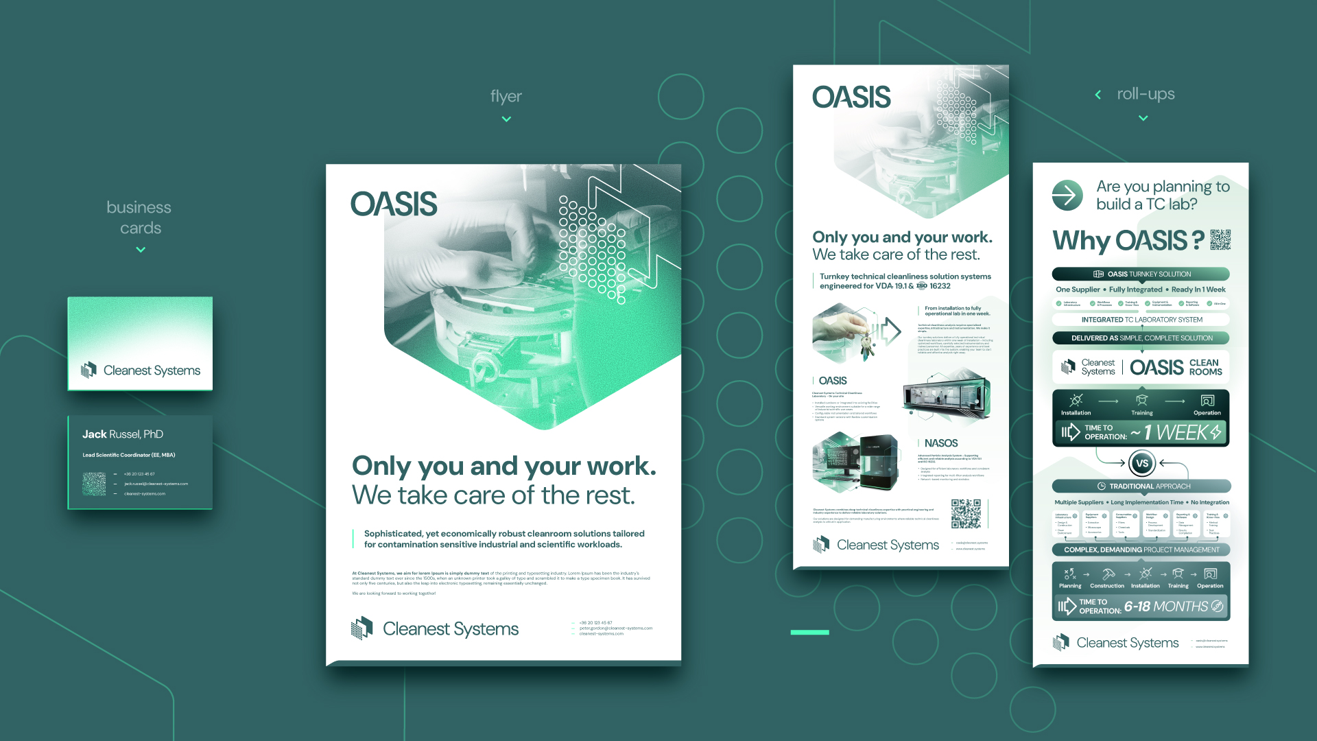
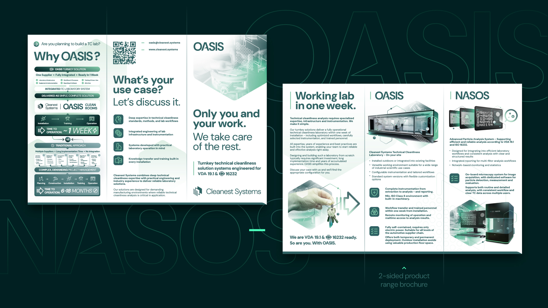
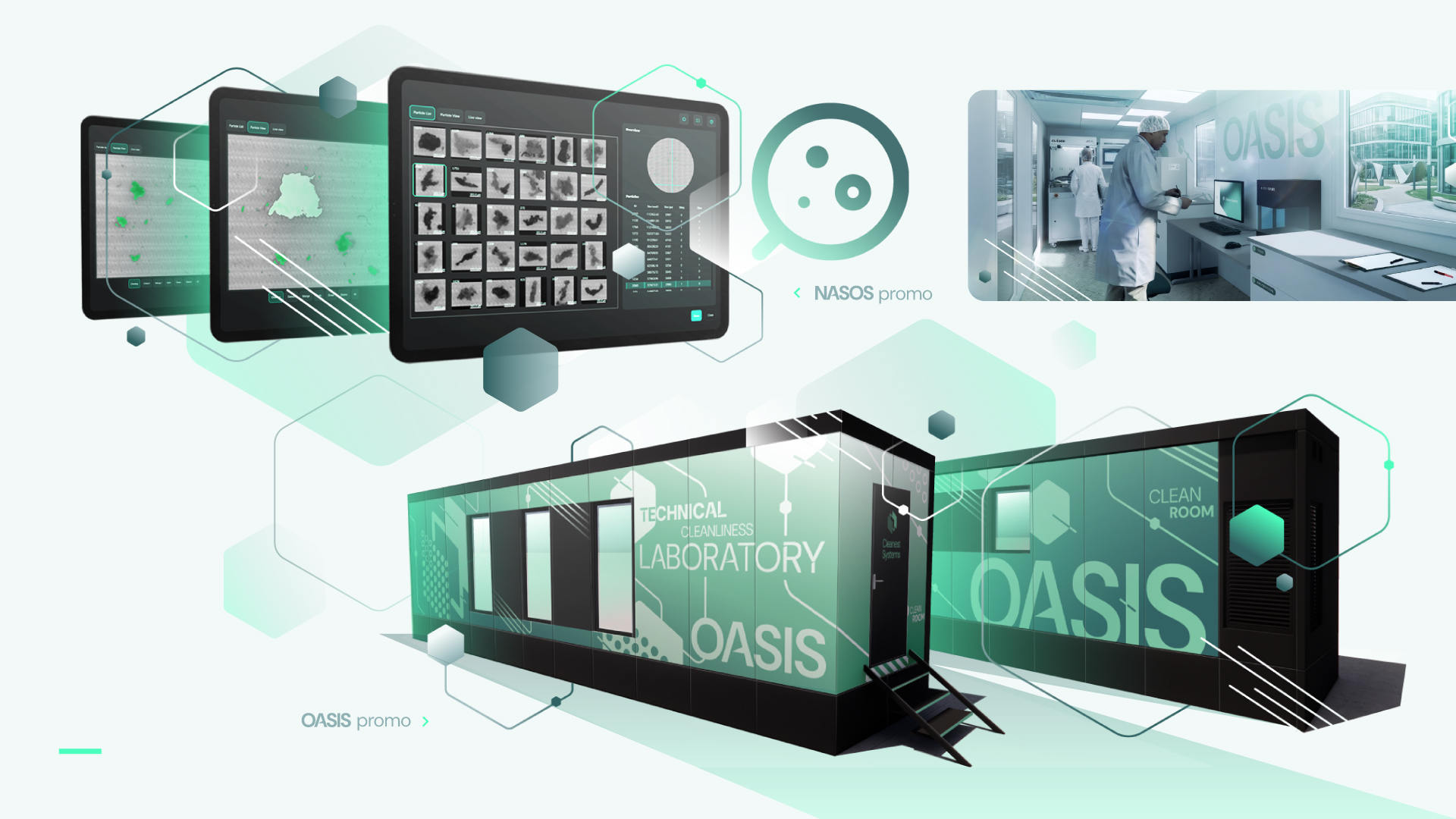
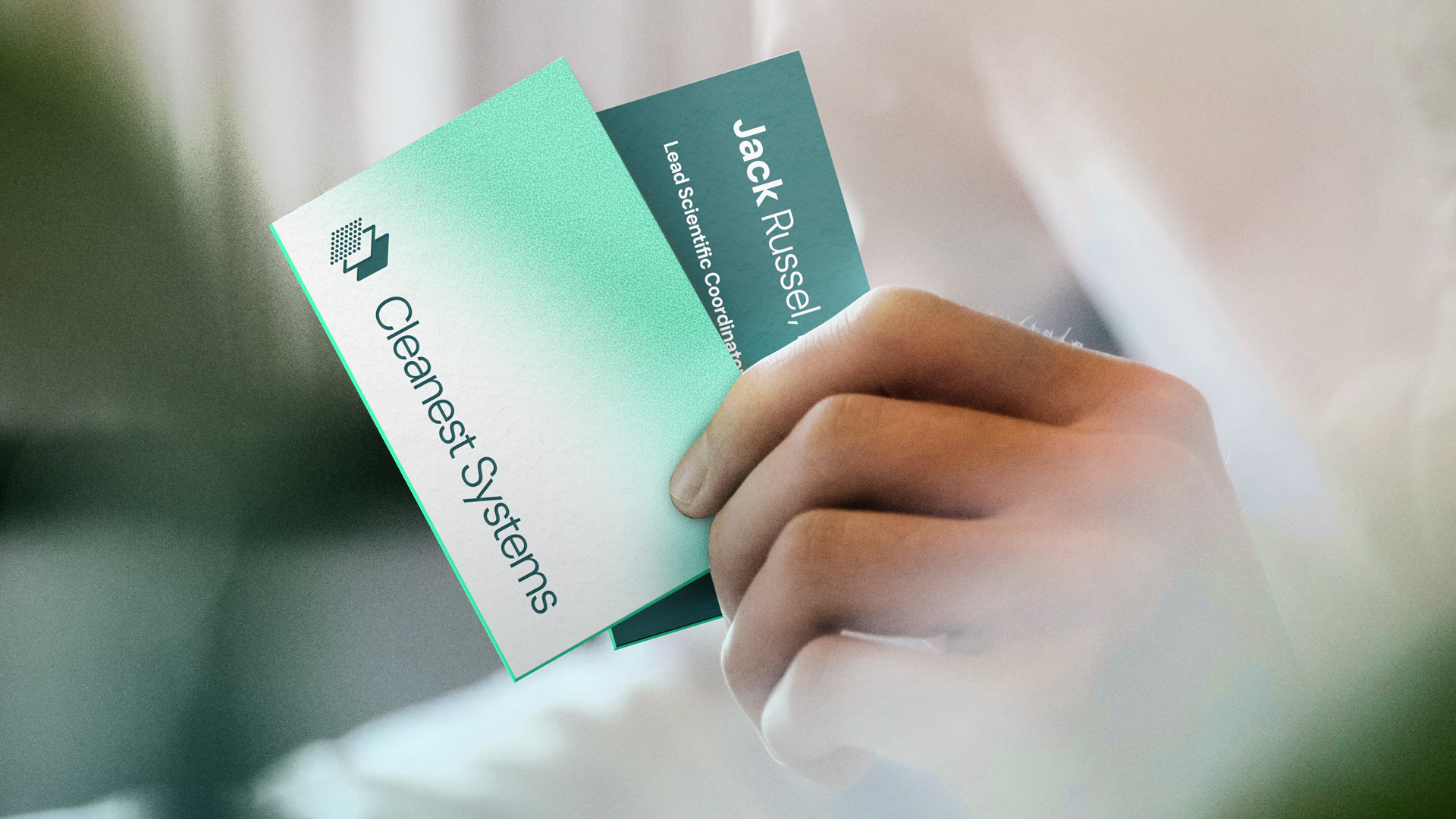
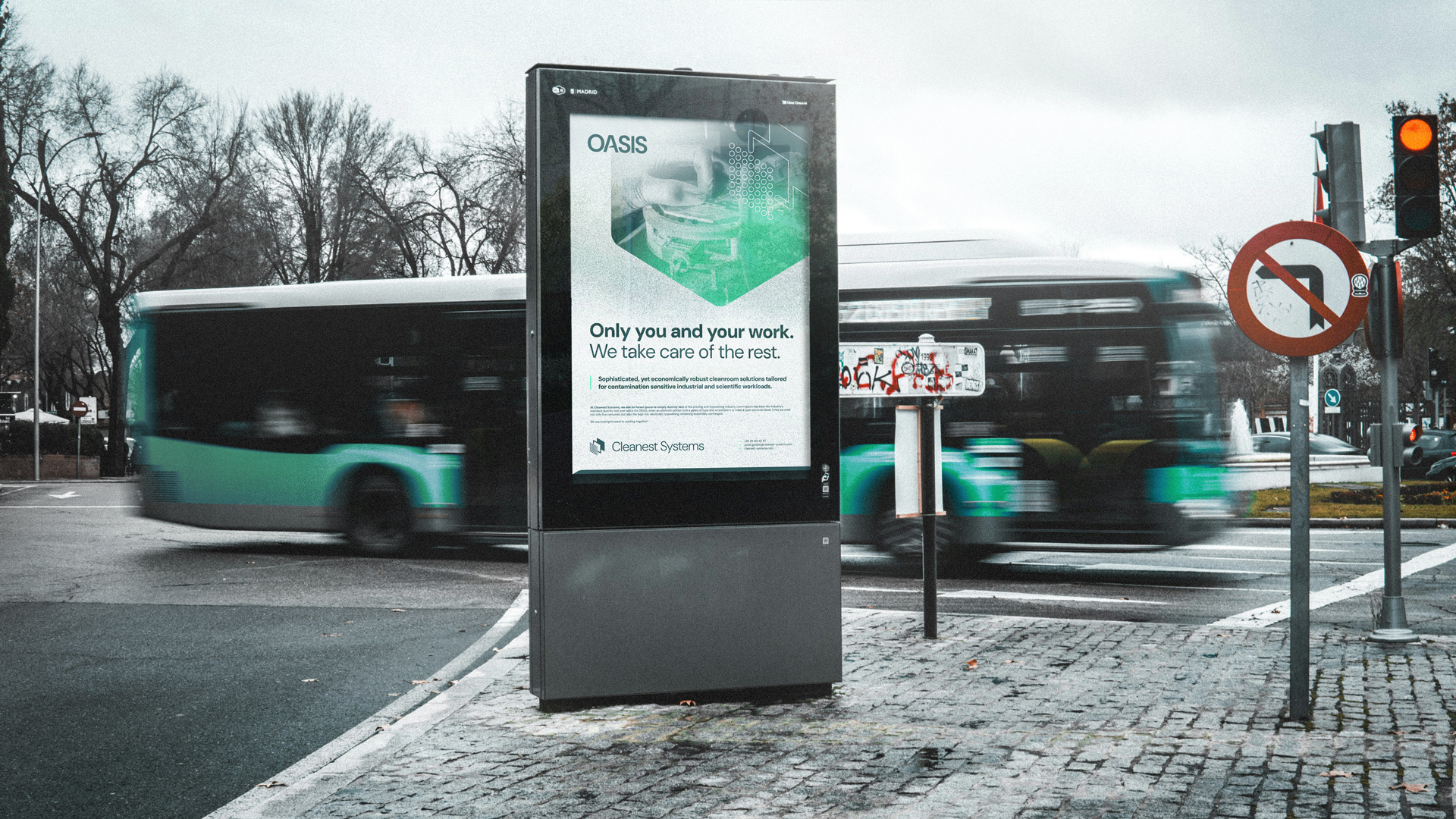
As a result, the website, promotional materials, the 11-meter walk-through OASIS container functioning as an exhibition booth, a simple business card, or a detailed brochure all operate within a unified brand system.
Each touchpoint remains visibly related, yet the system allows each a unique character best suited to its specific medium and role.
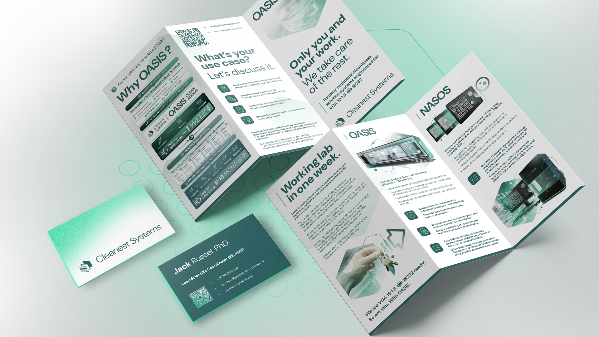


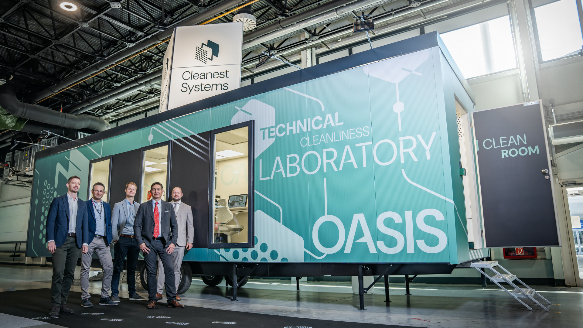
Image courtesy
The presentation images use the photos of Adrien, Benjamin Brunner, Cardmapr, CDC USA, Declan Sun, Diego Alexander, Egor Komarov, Gabriella Natiello, Henki, Il Vagabiondo, Kiwihug, Mockup Free, Priscilla Du Preez és Toon Lambrechts from Unsplash.
Thank you!